
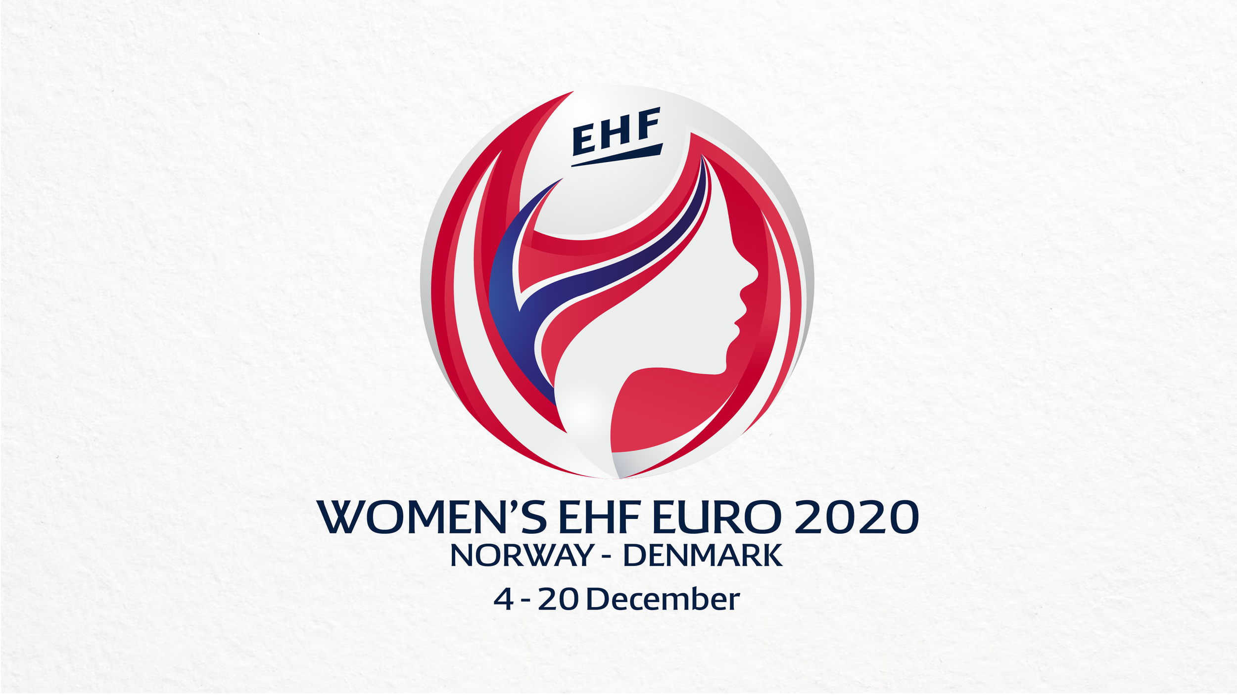
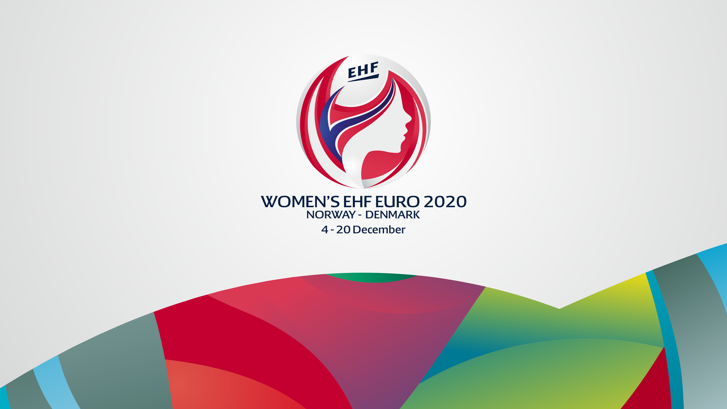
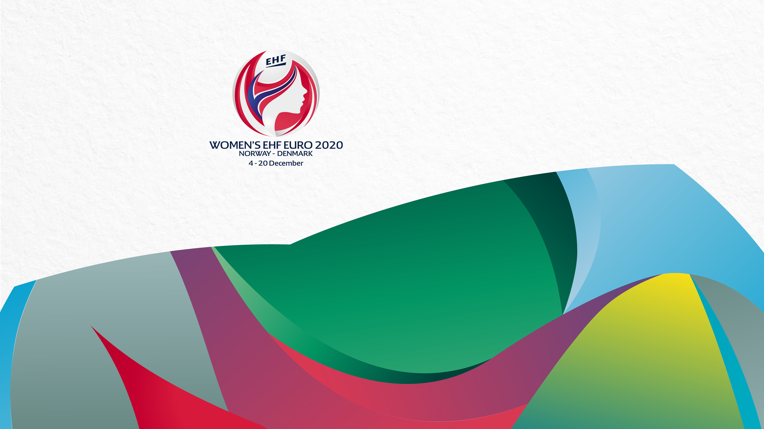
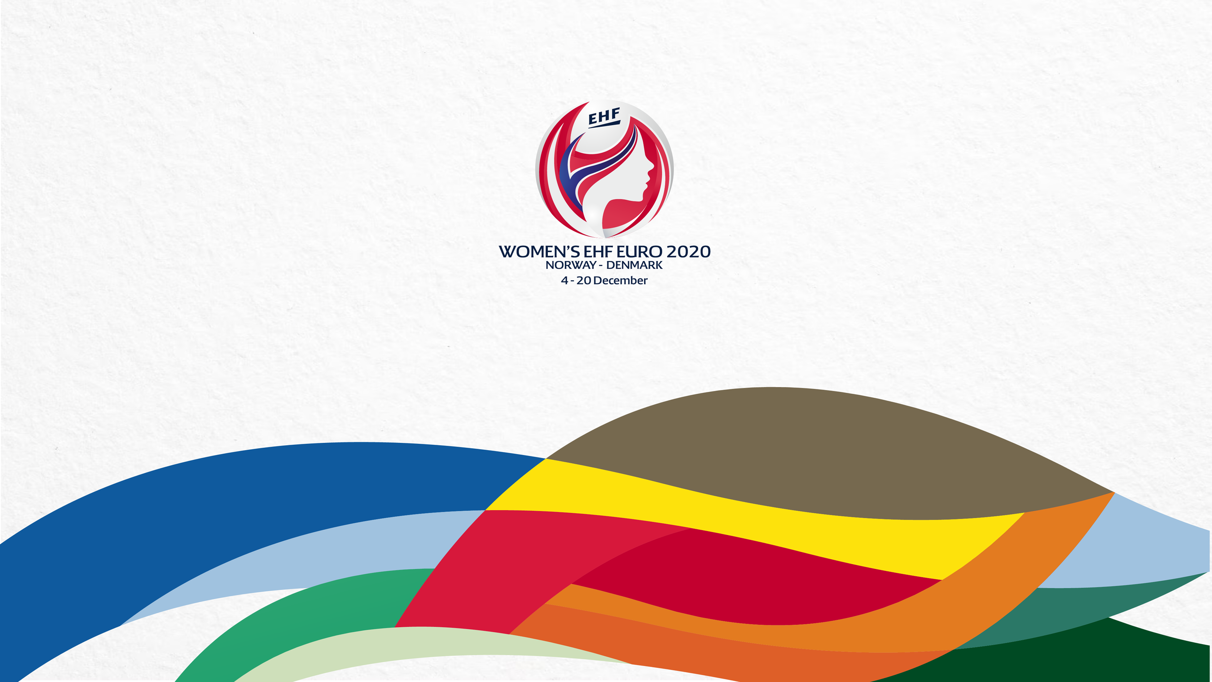
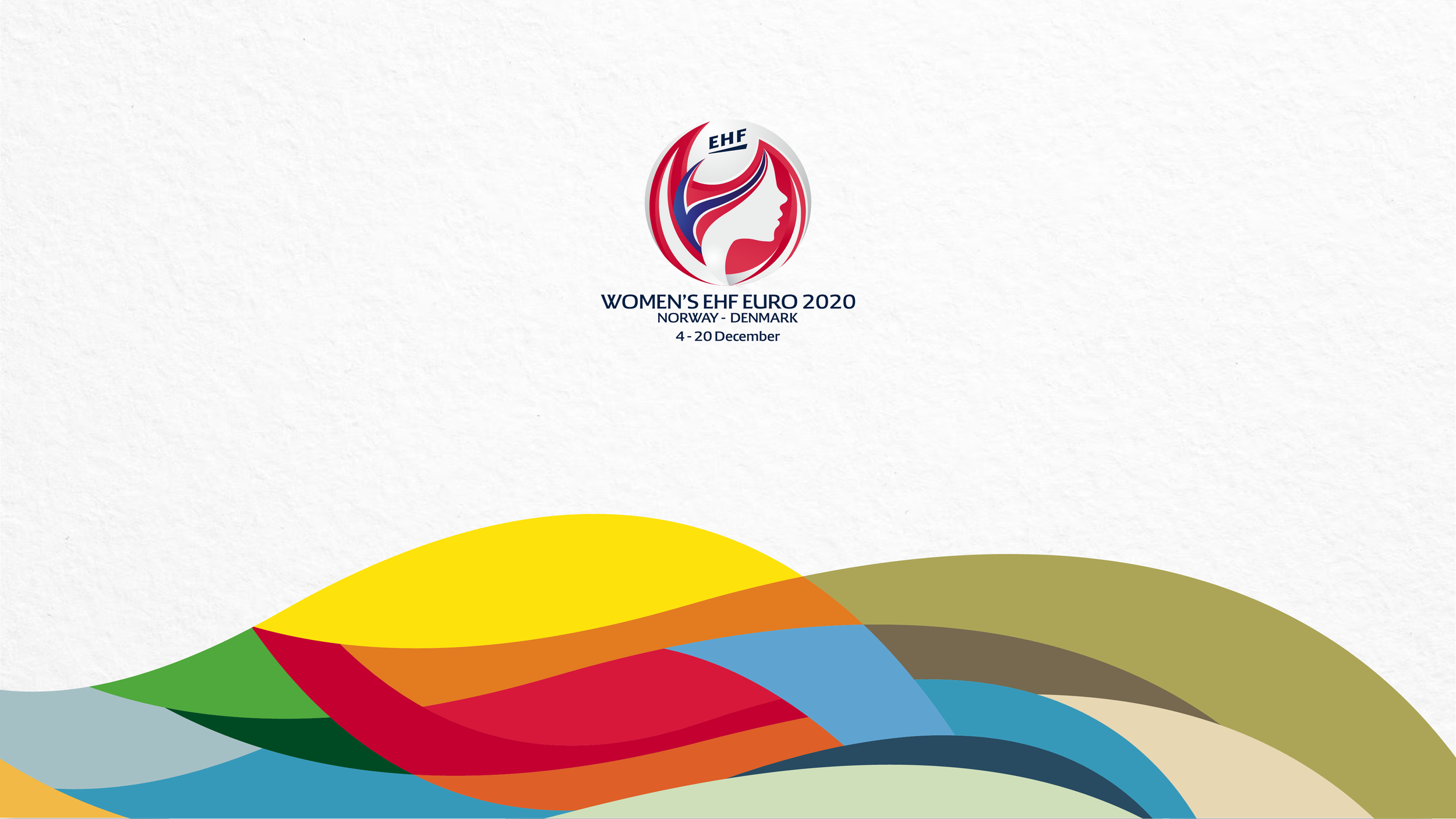
WOMEN’S EHF EURO 2020
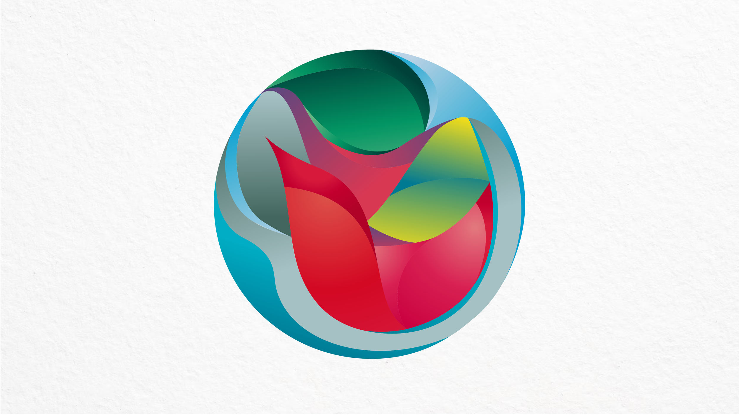
For the Women’s EHF EURO 2020, we created a unique logo centered around a powerful silhouette. This figure symbolizes all participating female athletes and unites the two host nations, Denmark and Norway, through a harmonious blend of their national colors.
The design reflects strength, unity, and the collective spirit of women’s handball at the highest level. It celebrates not only the competition, but the athletes and countries that brought it to life.
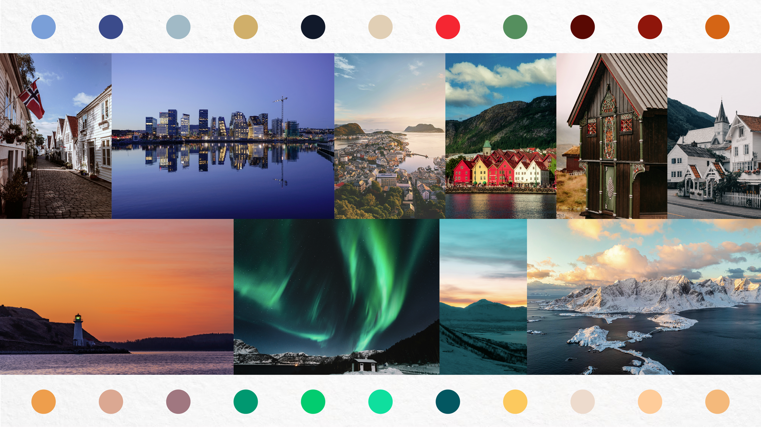
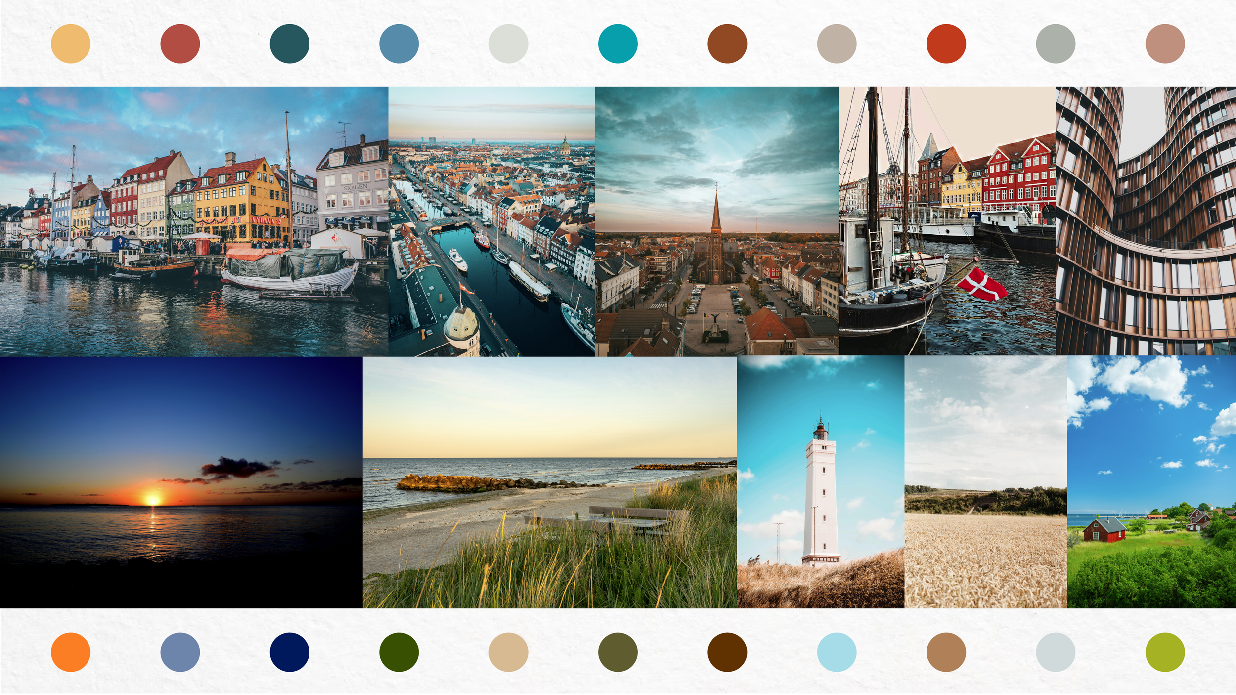
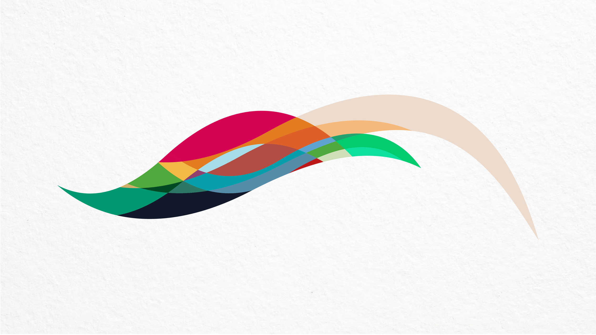
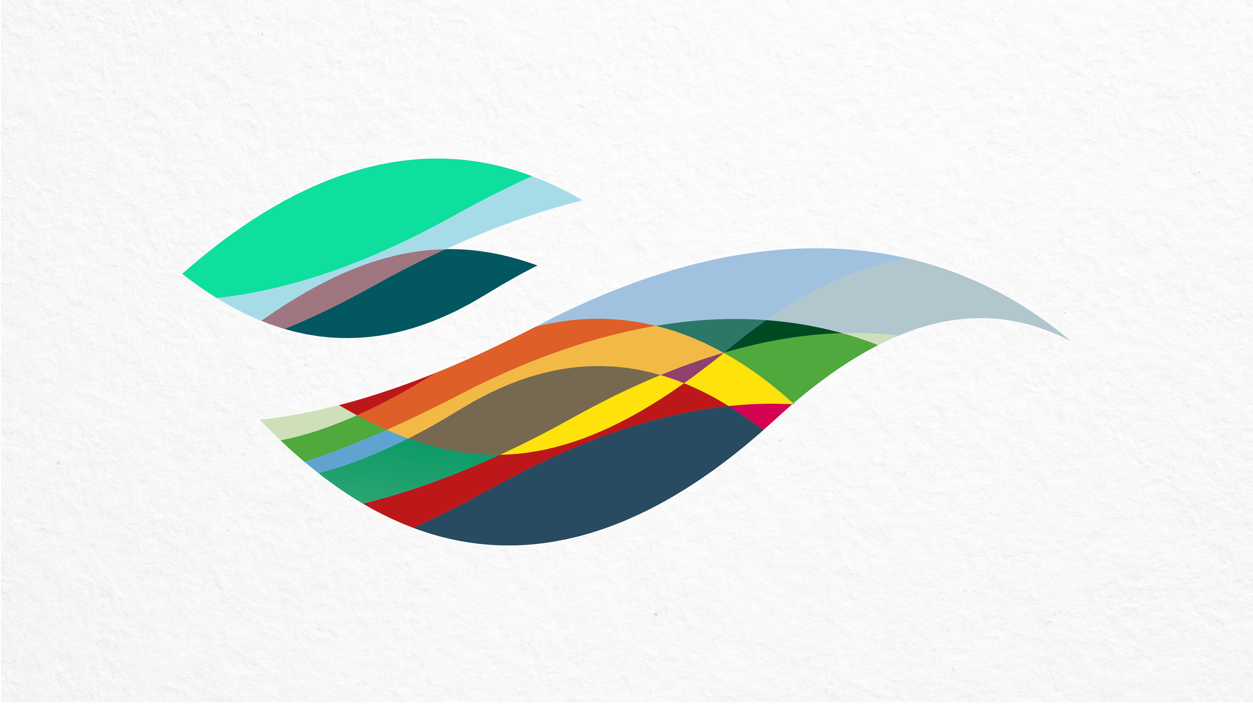
Elemental Motion
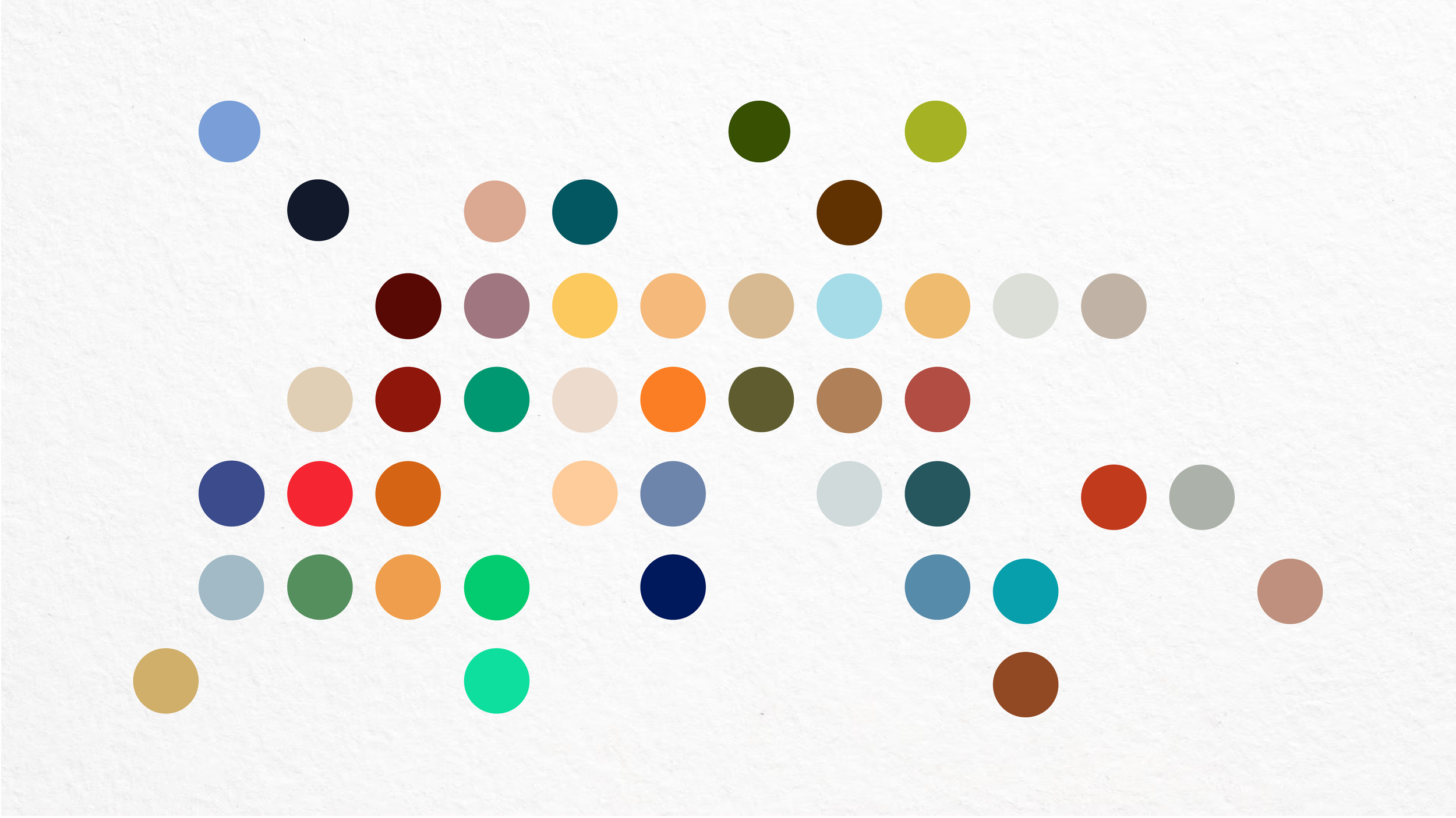
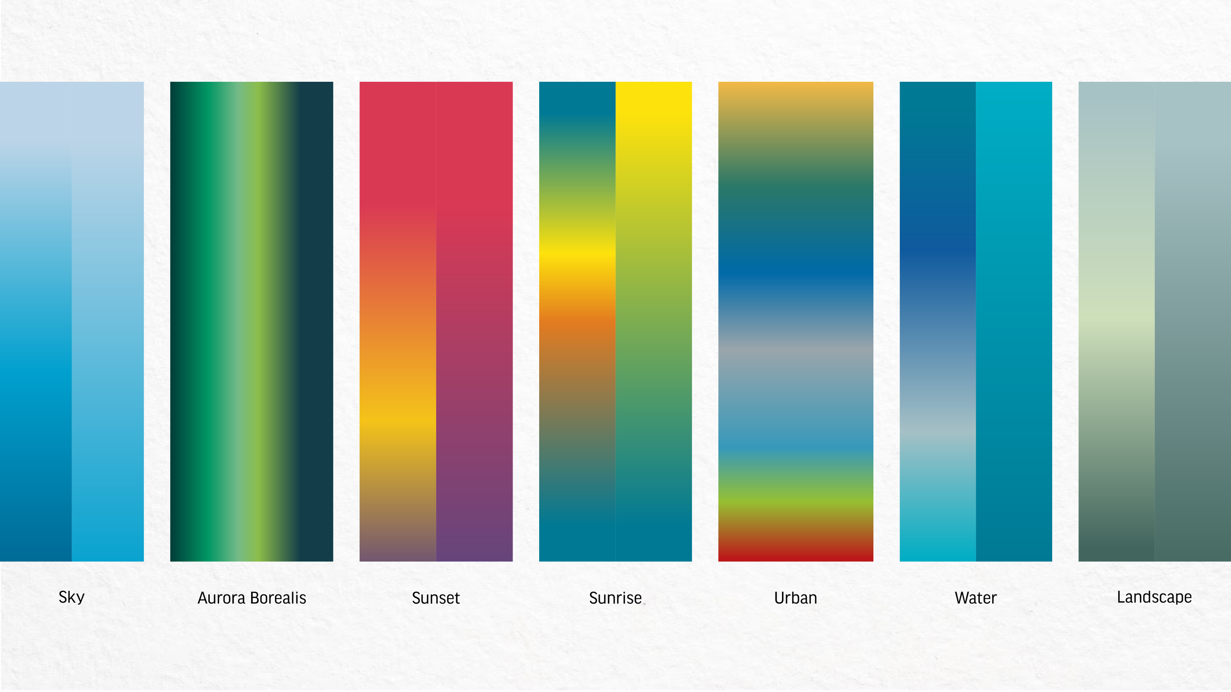
In addition, we created Elemental Motion — a visual system that reflects the natural and urban beauty of the host nations, Norway and Denmark. Inspired by the Aurora Borealis, fjords, flowing water, cityscapes, and shifting weather patterns, it captures the dynamic essence of both landscape and atmosphere.
Organic shapes and expressive gradients echo the logo’s circular form, bringing movement, unity, and emotion to every level and touchpoint of the championship identity. The result is a living color system that feels both rooted in place and full of energy.
Creative Direction
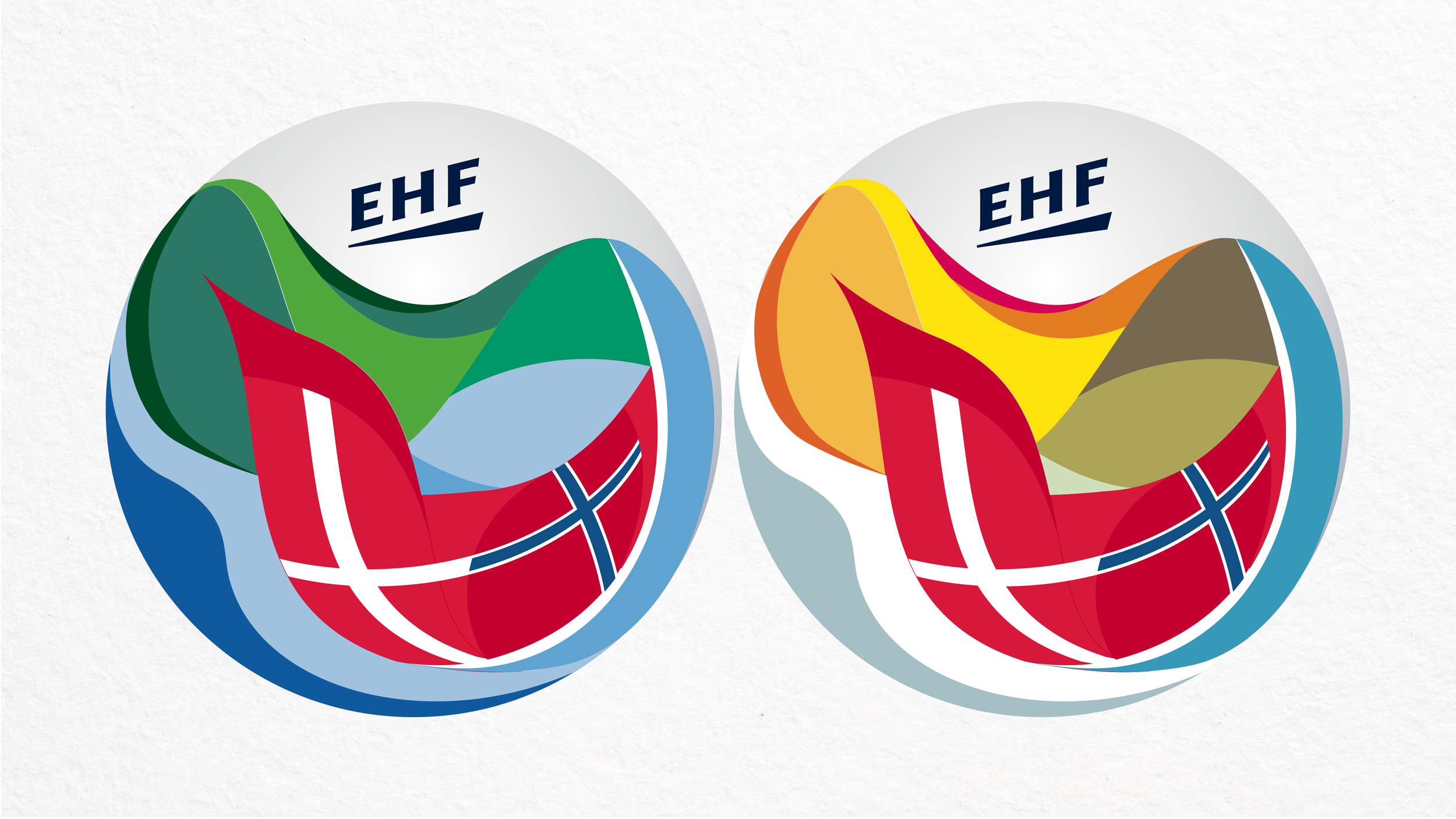
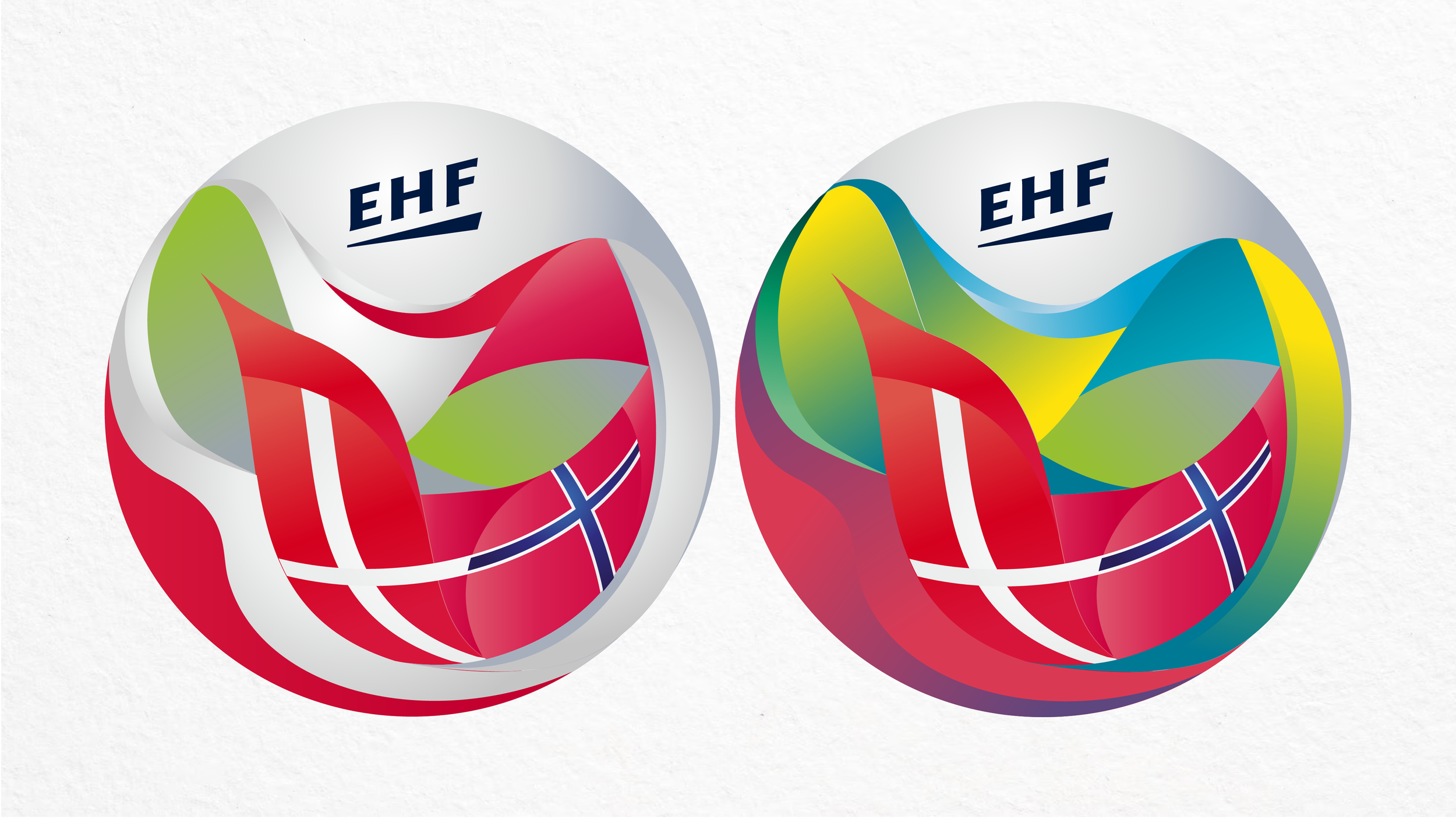
WOMEN’S EHF EURO 2020 Logo
WOMEN’S EHF Elemental Motion
WOMEN’S EHF EURO Logo Usage Guidelines
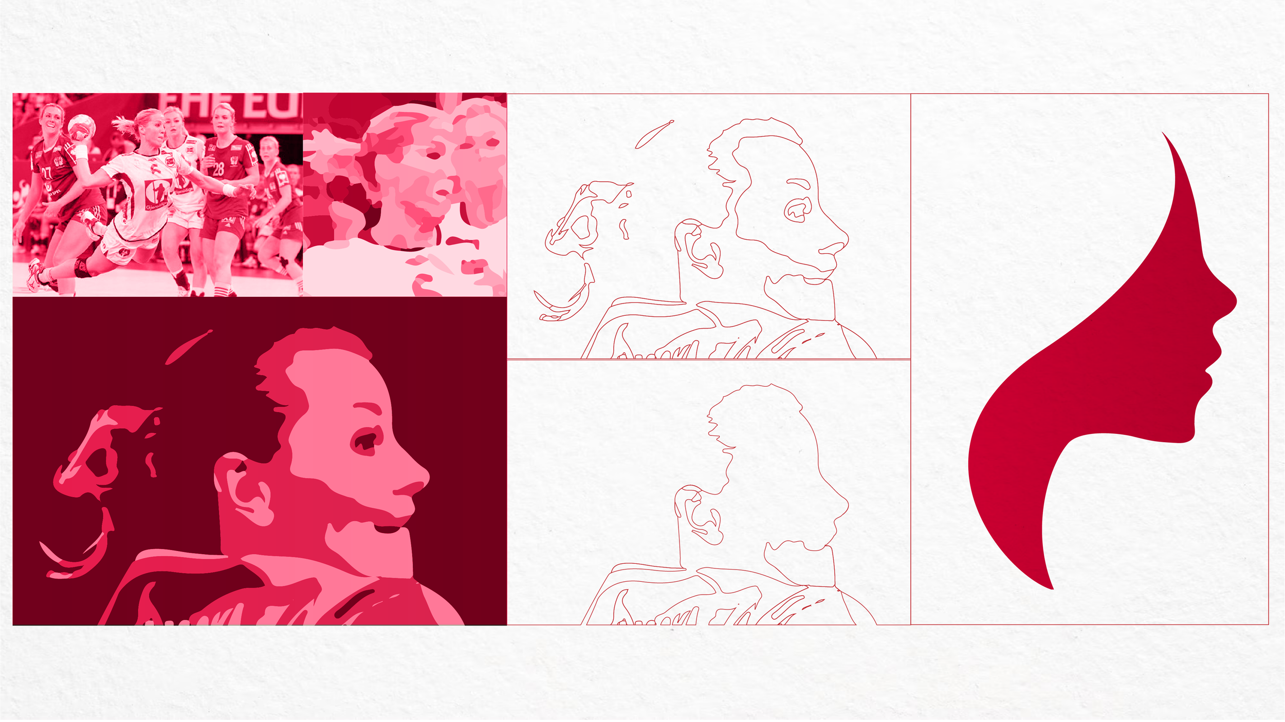
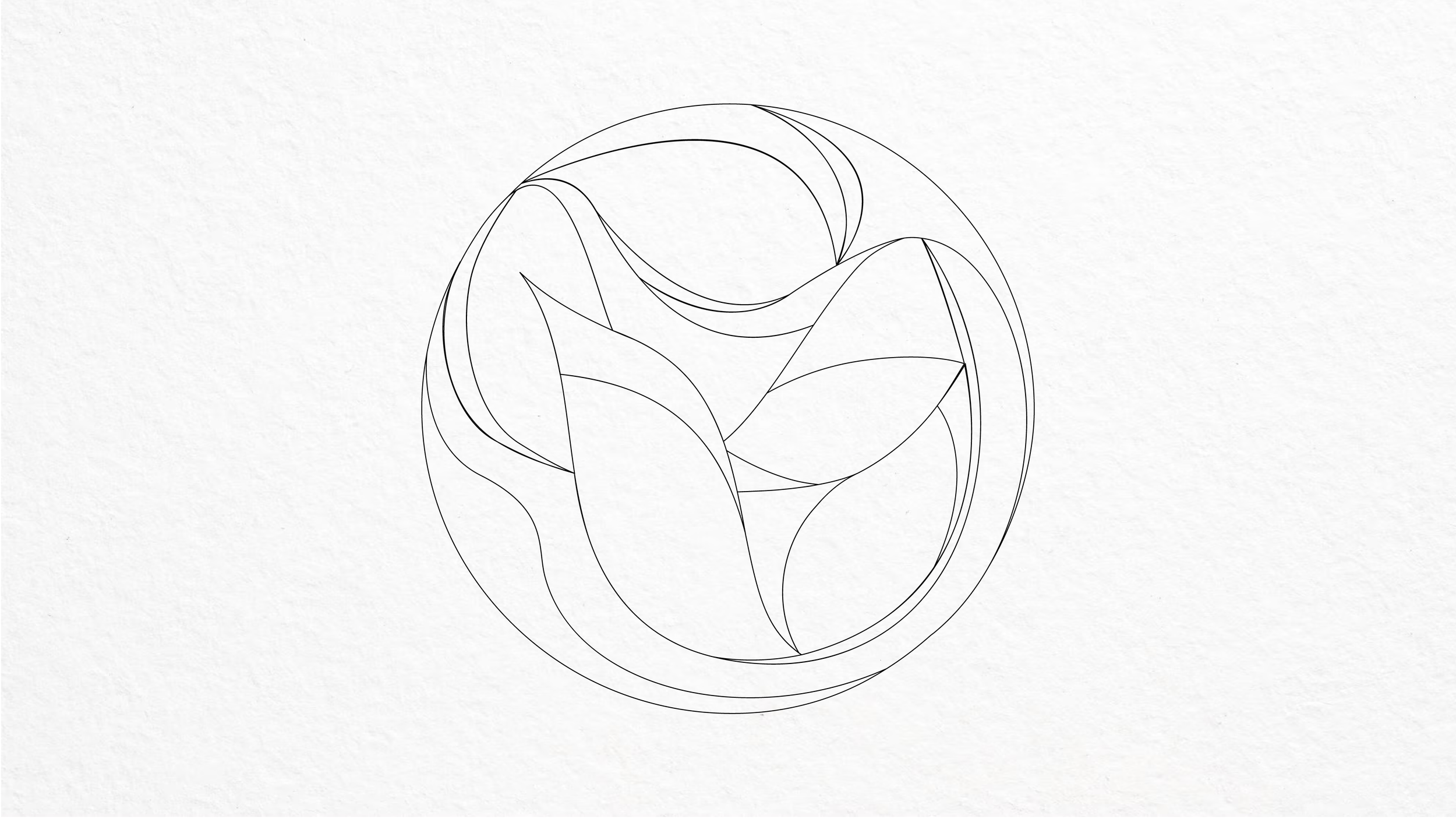
Development