
ASAAN
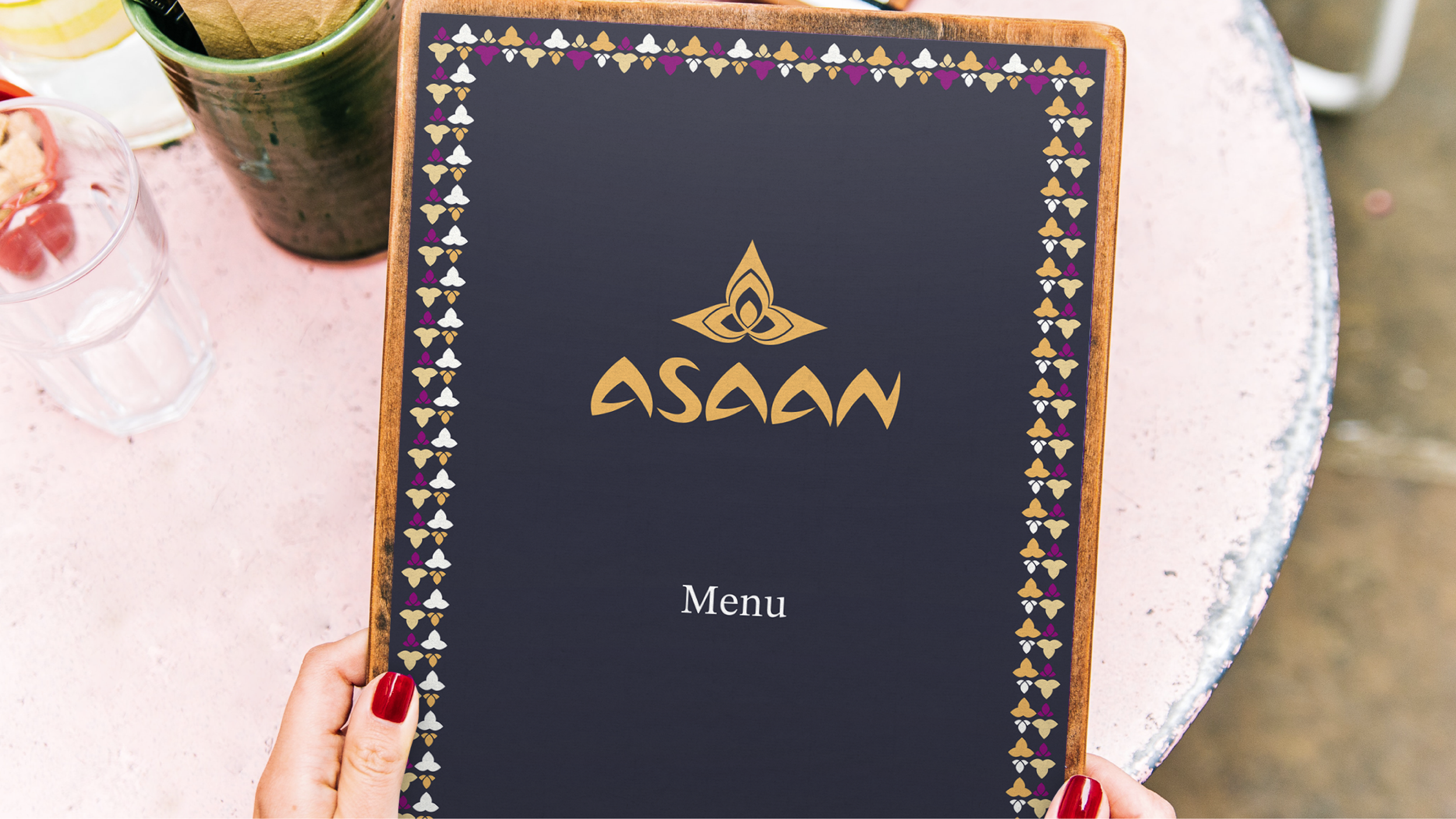
In designing the Asaan logo, we wanted to capture the essence of offering simple, easy cuisine, focusing on authentic Thai flavors at their core. The name Asaan, derived from the Thai word meaning "simple" or "easy," reflects the restaurant's philosophy of providing a straightforward and approachable dining experience.
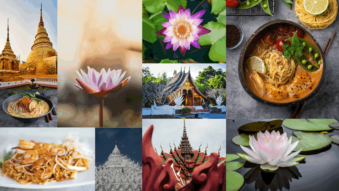
Inspired by the Thai lotus flower, a symbol of purity, transformation, and beauty, we used it as the central motif. The custom wordmark blends the organic curves of the lotus with the structured lines of Thai pagodas, symbolizing a balance between tradition and modernity, much like Asaan itself.


Creative Direction
Brand Design
Logo Design
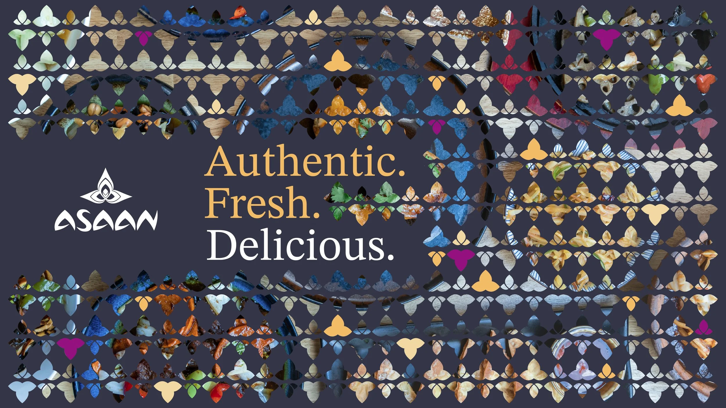
Collaterals
Development