
TOUR DE SUISSE
With approximately 1 million spectators along the course and at the start and finish areas, the Tour de Suisse generates extensive marketing possibilities as the only national sports event crossing the entire country.
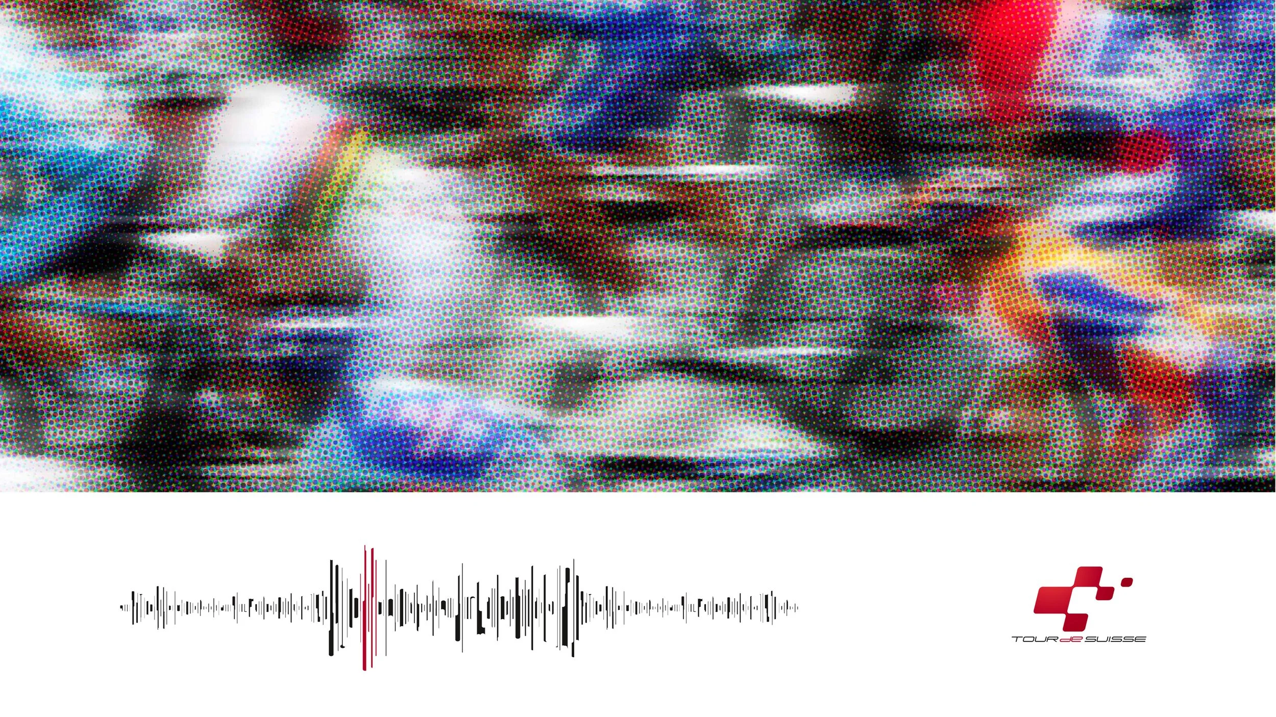
Cinematography & Sound // Etienne Koch // Live-Type-Design: RWDesign // Motion Design: Patrick Ensslin
The Tour de Suisse logo
The logo visually captures the essence of the Tour de Suisse brand, featuring two key elements: the symbol and the text mark. It embodies energy, dynamism, movement, and Swiss identity.
Here’s how the briefing went:
RWDesign: Do you have a specific vision or design direction for the logo?
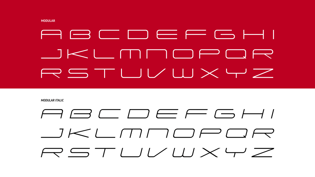
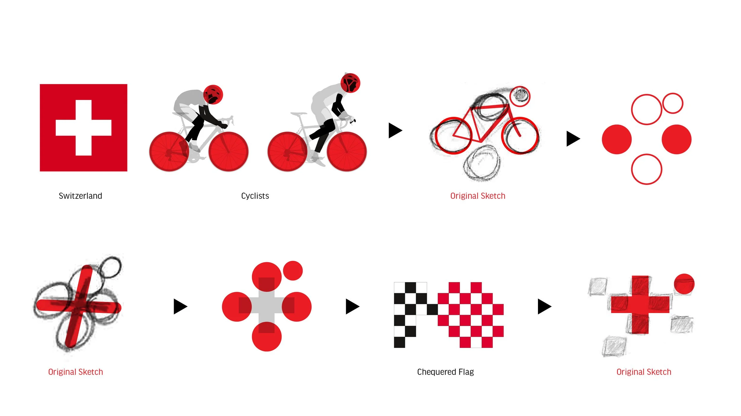
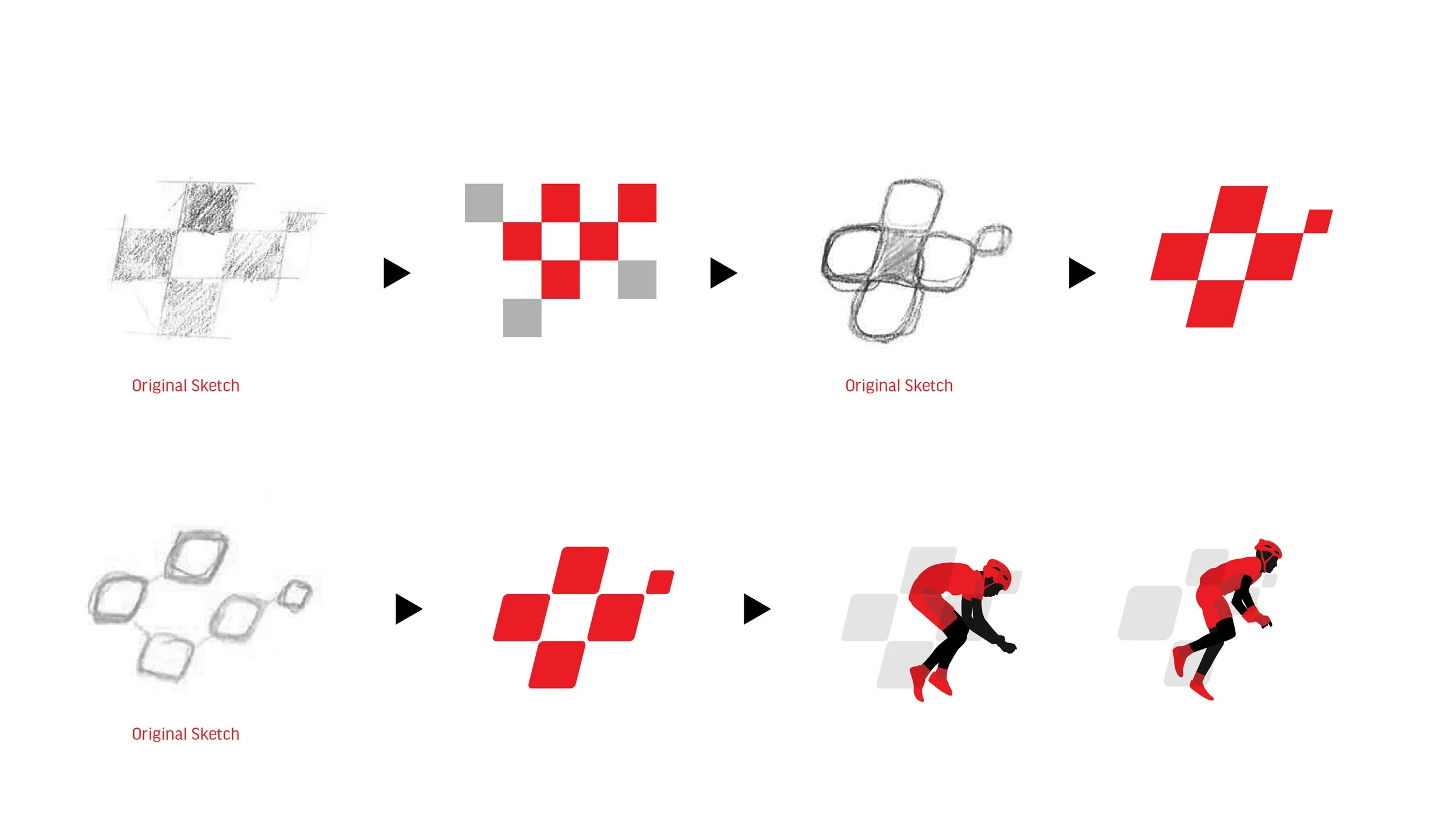
Client: Yes, we want it to be as simple as the Apple logo. Ideally, it should subtly evoke the image of a cyclist. We’d also like to incorporate the Swiss cross and, if it’s not too much, a chequered flag. And one more thing, please create a custom font for the text mark. A generic font won’t do. It needs to be delicate yet modern and dynamic, capturing the racing spirit.
RWDesign:Challenge accepted!
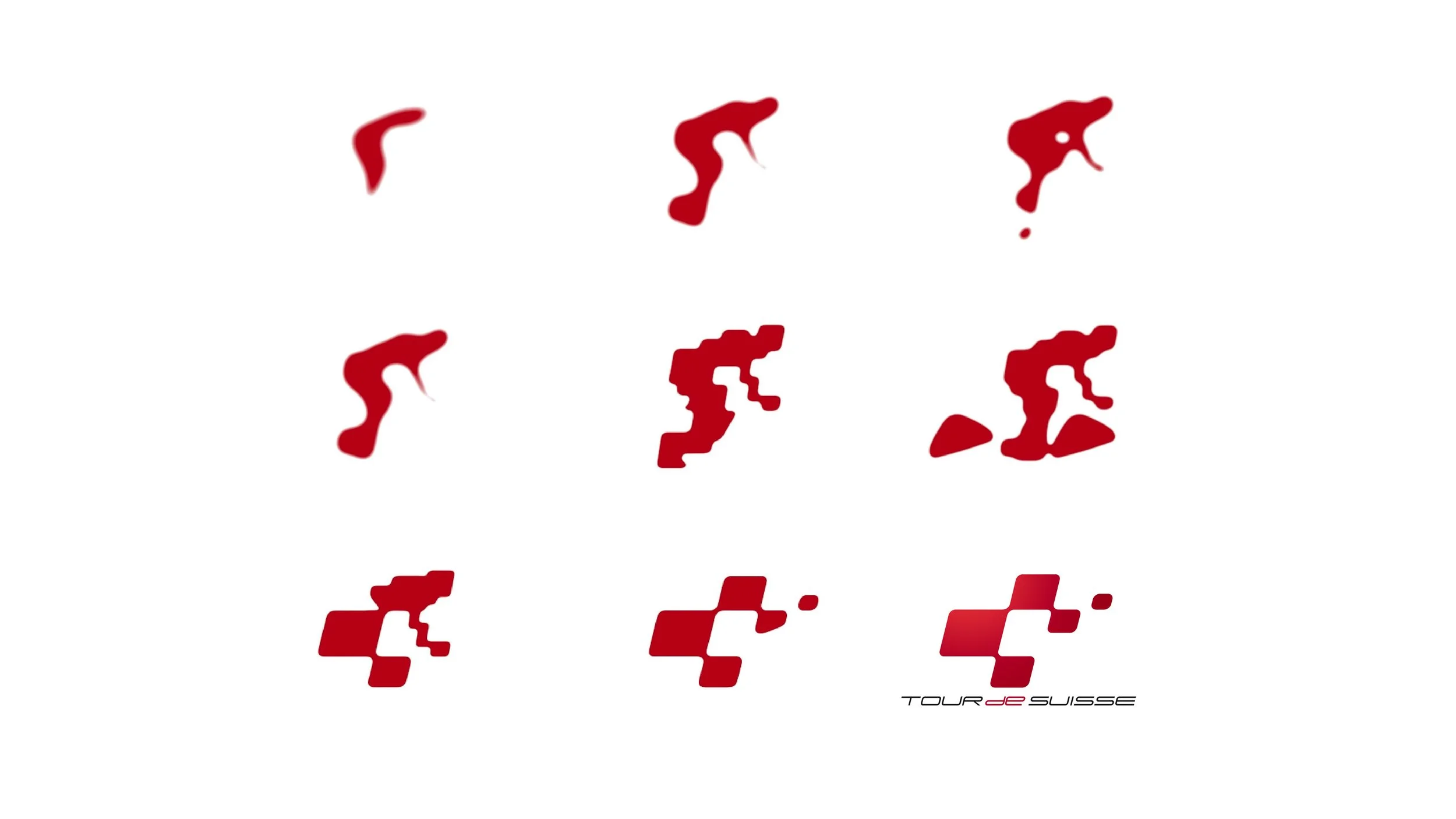
Sequences of the animated cyclist transforming into the Tour de Suisse logo // Logo Design: RoyWedemaDesign // Motion Design: Patrick Ensslin

MODULAR Font // Design: RoyWedemaDesign // Motion Design: RoyWedemaDesign
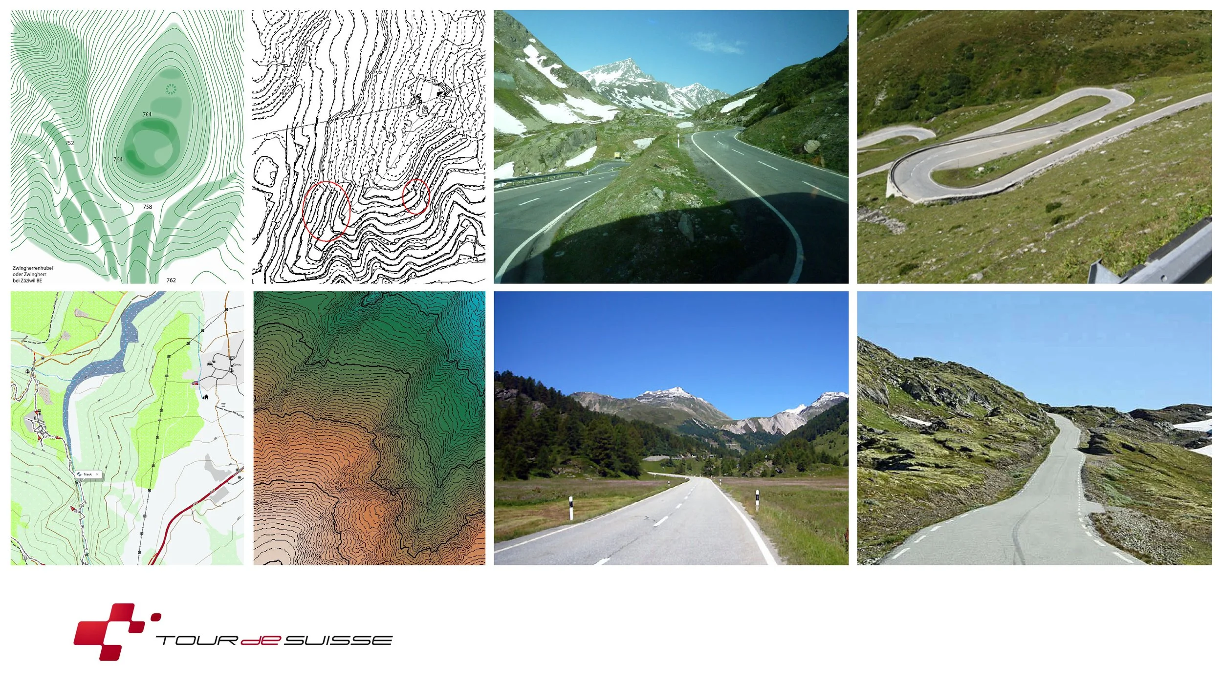
Design Process // Tour de Suisse Logo // RoyWedemaDesign
Design Process // Tour de Suisse Logo // RoyWedemaDesign
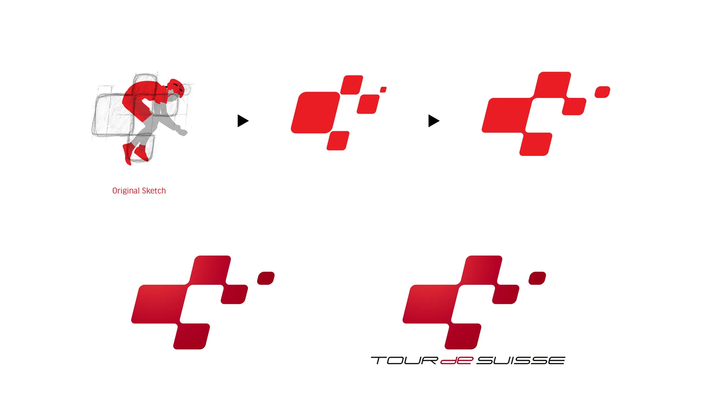
Design Process // Tour de Suisse Logo // RoyWedemaDesign
Brand Design Process // Tour de Suisse // RoyWedemaDesign
Brand Design Process // Tour de Suisse // RoyWedemaDesign

Brand Design Process // Tour de Suisse // RoyWedemaDesign
Brand Design Process // Tour de Suisse // RoyWedemaDesign
Brand Design Process // Tour de Suisse // RoyWedemaDesign
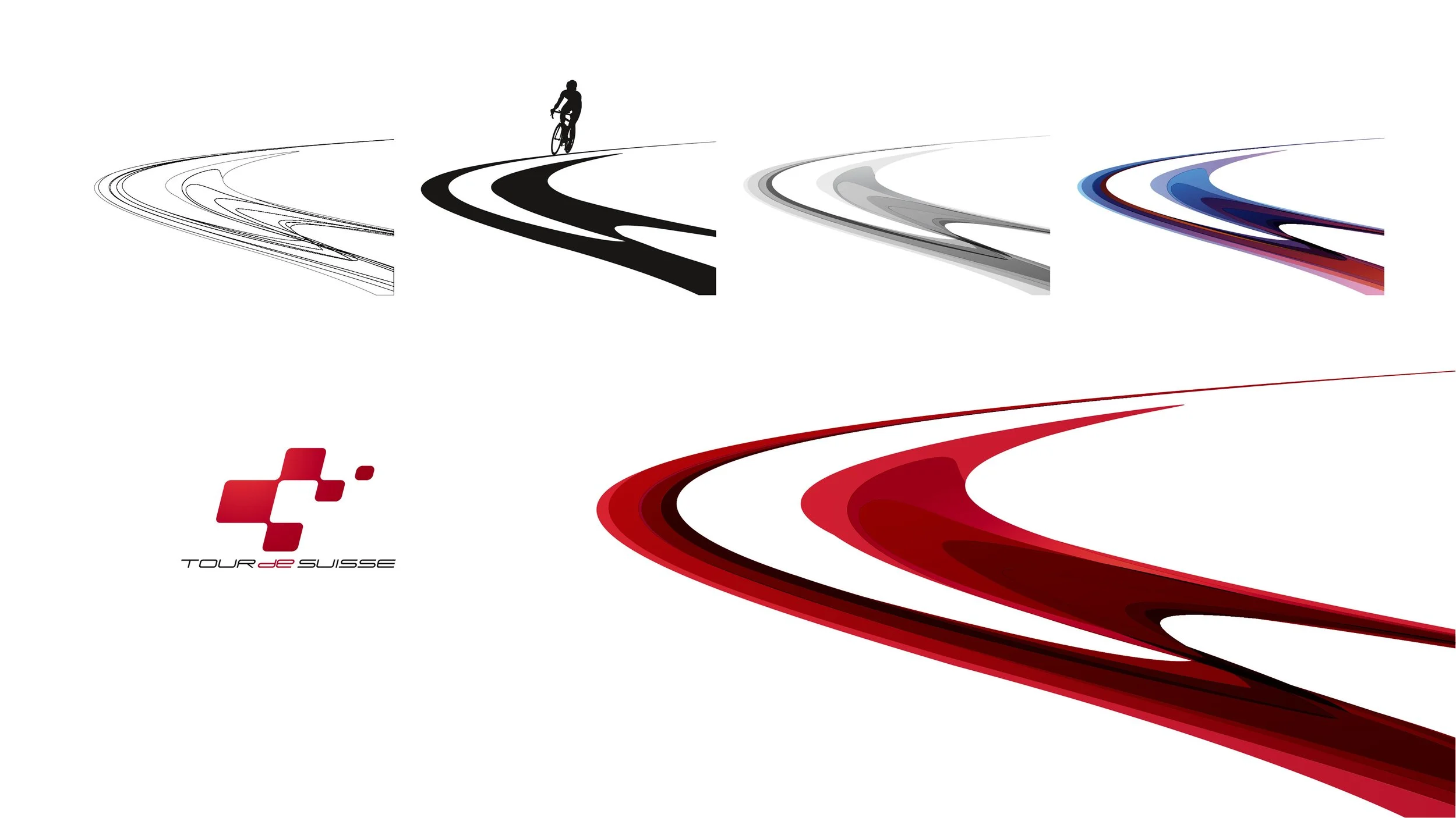
Brand Design Process // Tour de Suisse // RoyWedemaDesign
Brand Design Process // Tour de Suisse // RoyWedemaDesign
Assignment to RWD:
Re-Branding
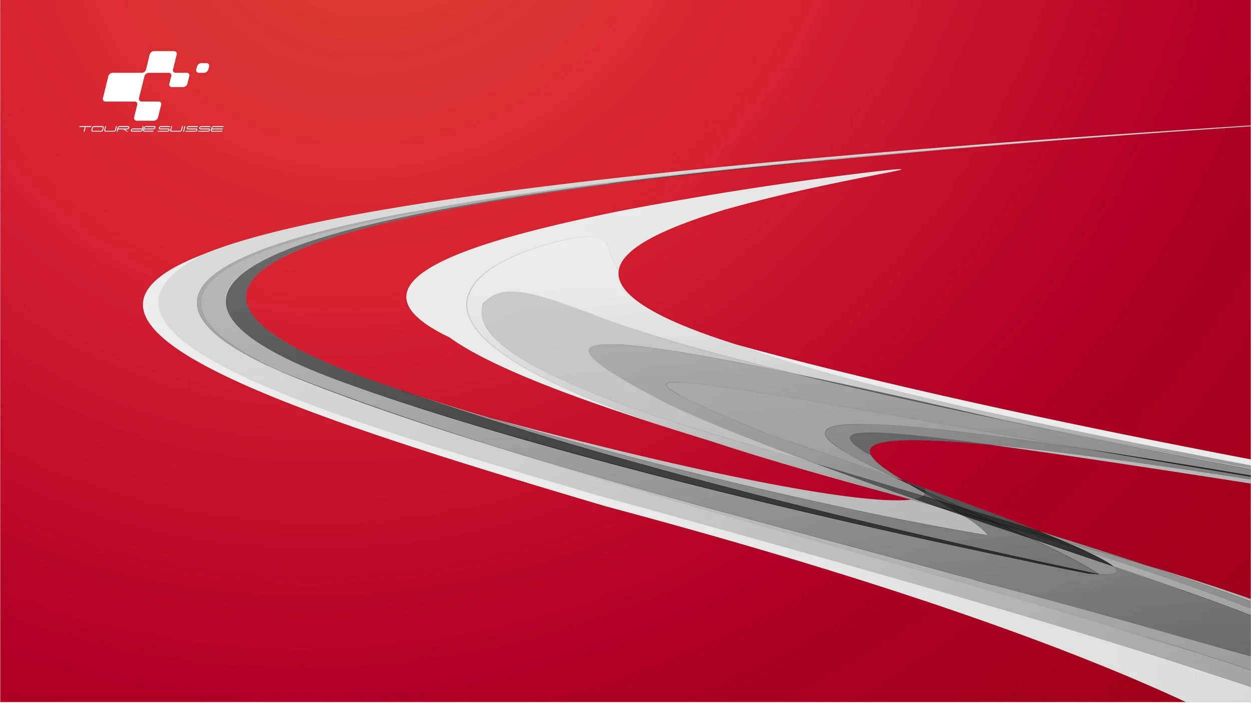
Corporate Design Concept
Event Branding
Creation of the official Trophy
Official TDS-Teaser
Implementation