
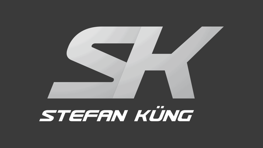
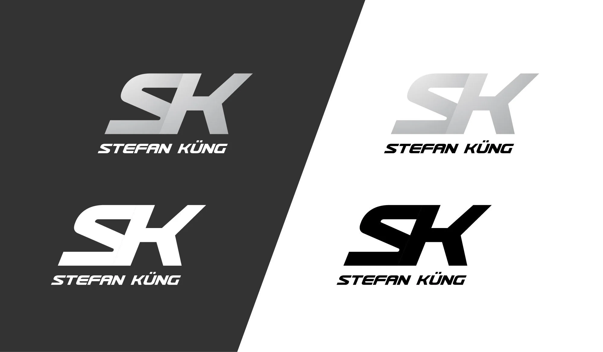
STEFAN KÜNG
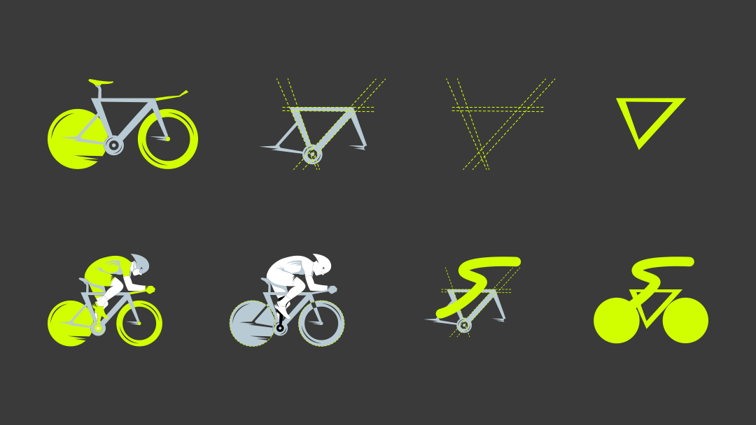
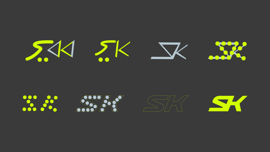
We designed a personal logo for Stefan Küng, incorporating the letters "S" and "K" from his first and last name. The letter "S" is inspired by the dynamic sitting position Stefan adopts during bike races, which naturally forms an S-shape. The letter "K" is derived from the unique frame geometry of his race bike.
The logo is crafted in a simplistic and dynamic style to reflect Stefan's passionate and cool personality. It captures the essence of his interaction with his bike, symbolizing the harmony between man and machine that has fascinated him since childhood. Stefan’s journey from a young boy captivated by cycling to a professional cyclist striving for success and maximum performance is embodied in this logo. It represents his dedication, passion, and the joy he finds in the sport.


Creative Direction
Logo Design
Development