
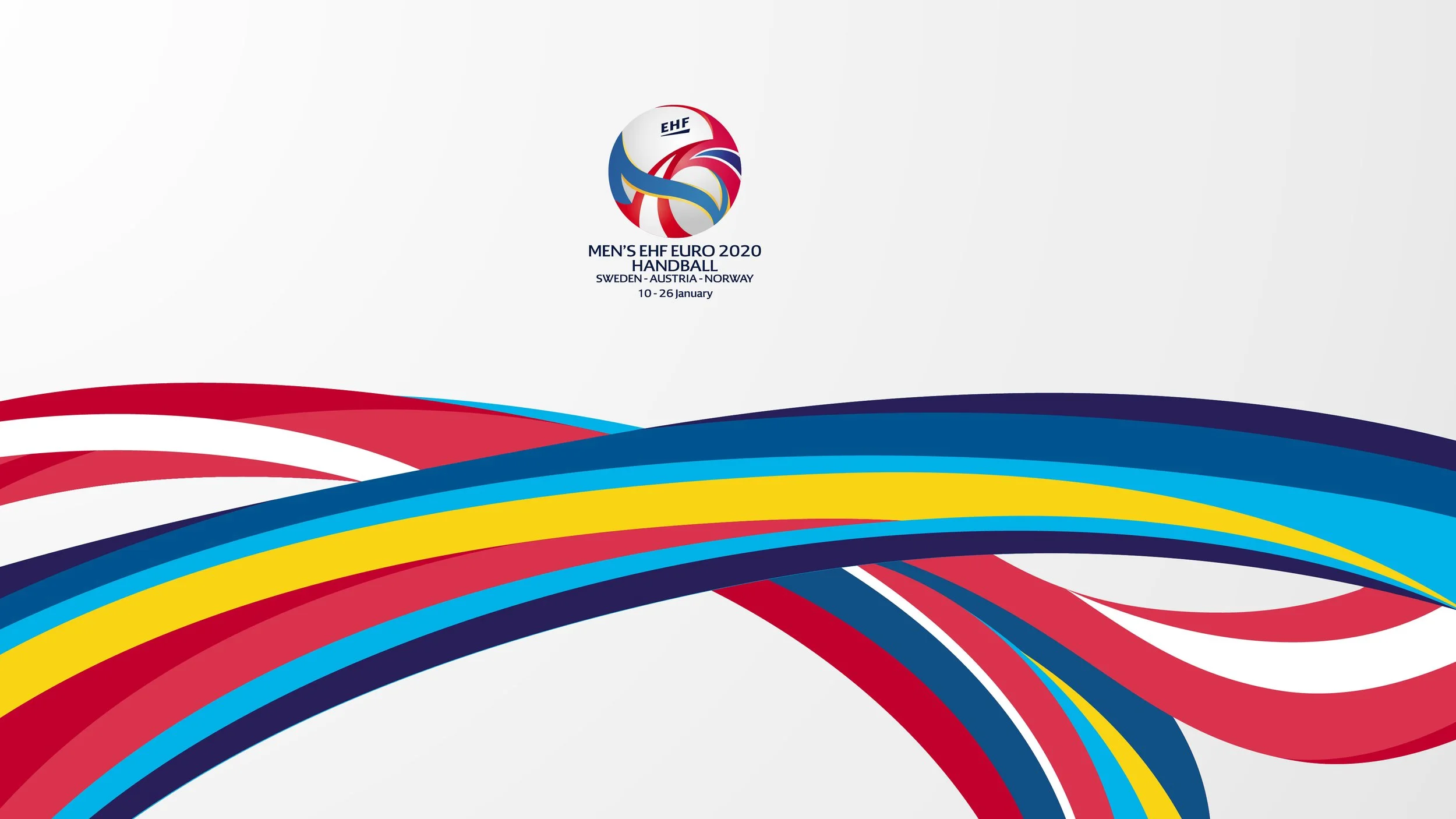
MEN’S EHF EURO 2020
The MEN’s EHF EURO 2020 was a milestone event: the first edition with 24 teams and the first to be co-hosted by three countries, Sweden, Austria and Norway. It also marked the debut of the new EHF logo system developed by RWDesign.
The hosts worked together as one team, united by a shared goal. This spirit of collaboration inspired the logo design: three national flags dynamically and organically merged into a single, powerful symbol of unity in European handball.

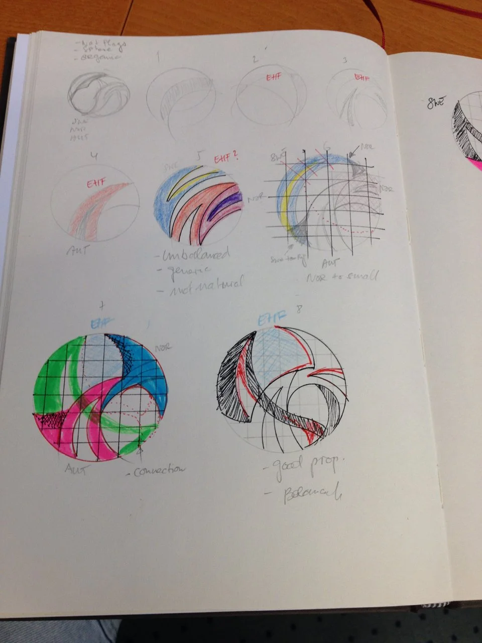
Design Process // MEN’S EHF EURO 2020 Logo // RoyWedemaDesign

Design Process // MEN’S EHF EURO 2020 Logo // RoyWedemaDesign

Design Process // MEN’S EHF EURO 2020 Logo // RoyWedemaDesign

Design Process // MEN’S EHF EURO 2020 Logo // RoyWedemaDesign
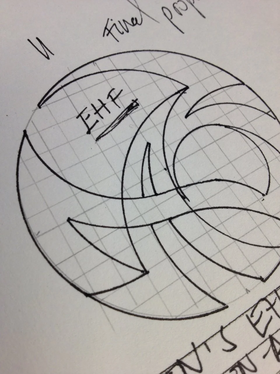
Design Process // MEN’S EHF EURO 2020 Logo // RoyWedemaDesign
Logo Template // MEN’S EHF EURO 2020 // RoyWedemaDesign
MEN’S EHF EURO 2020 Logo // RoyWedemaDesign
MEN’S EHF EURO 2020 Logo // RoyWedemaDesign
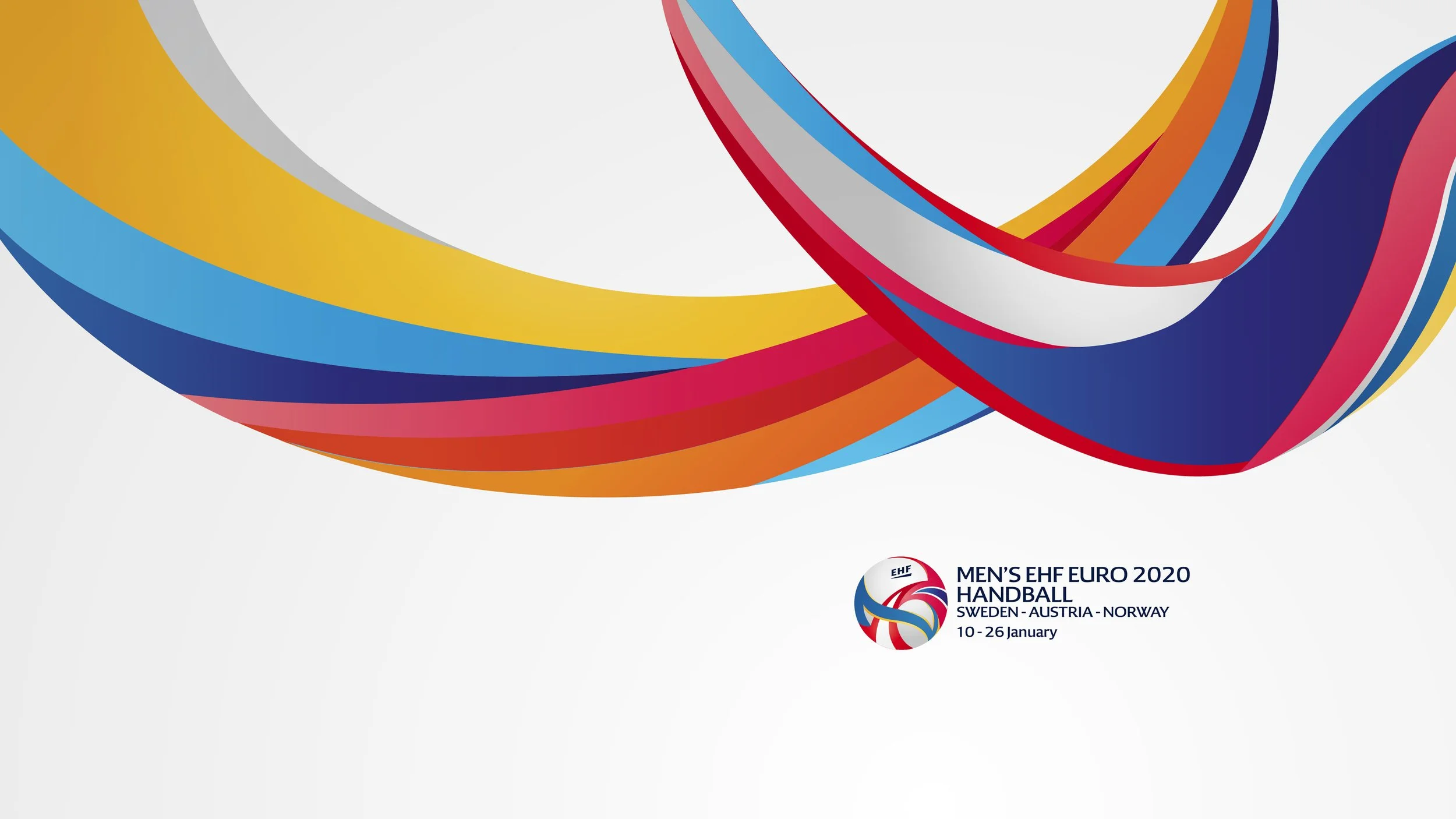
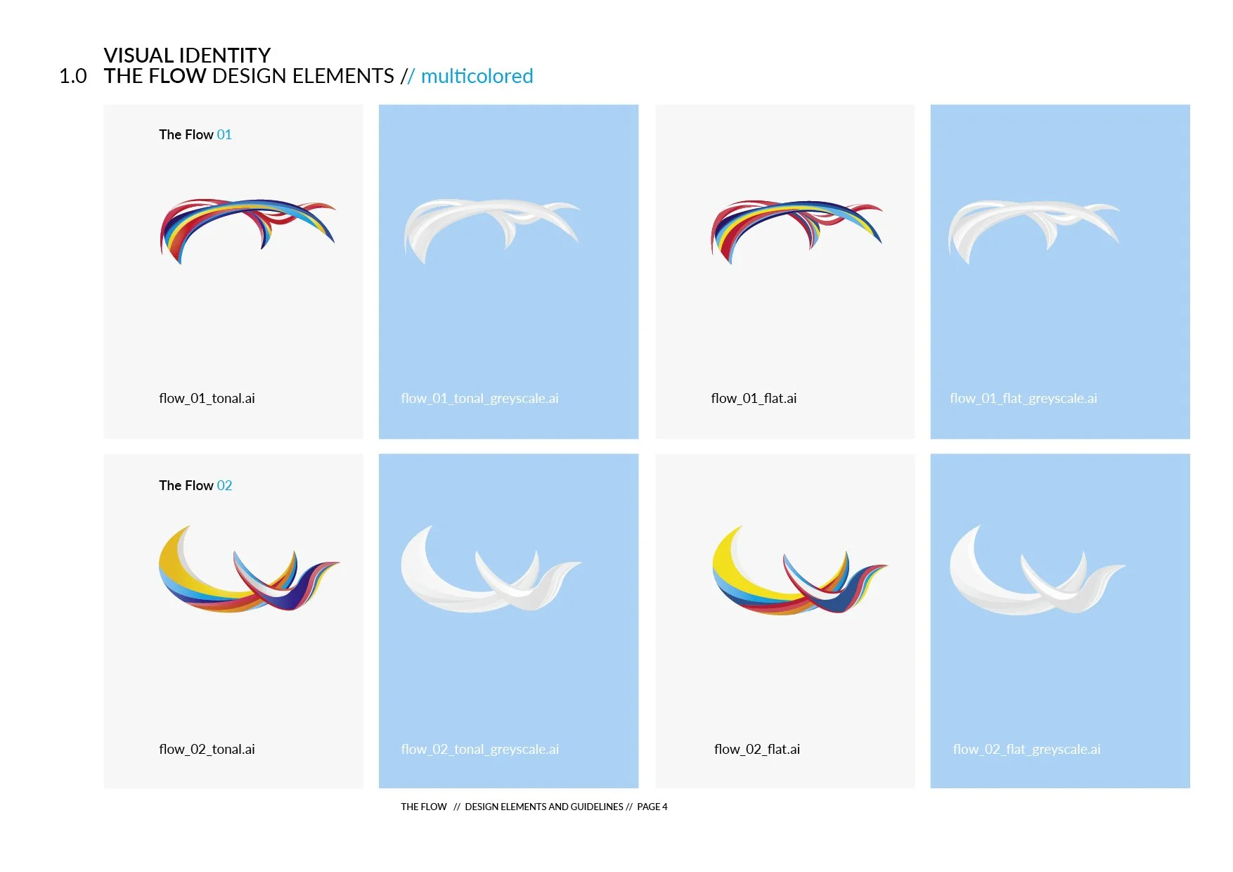
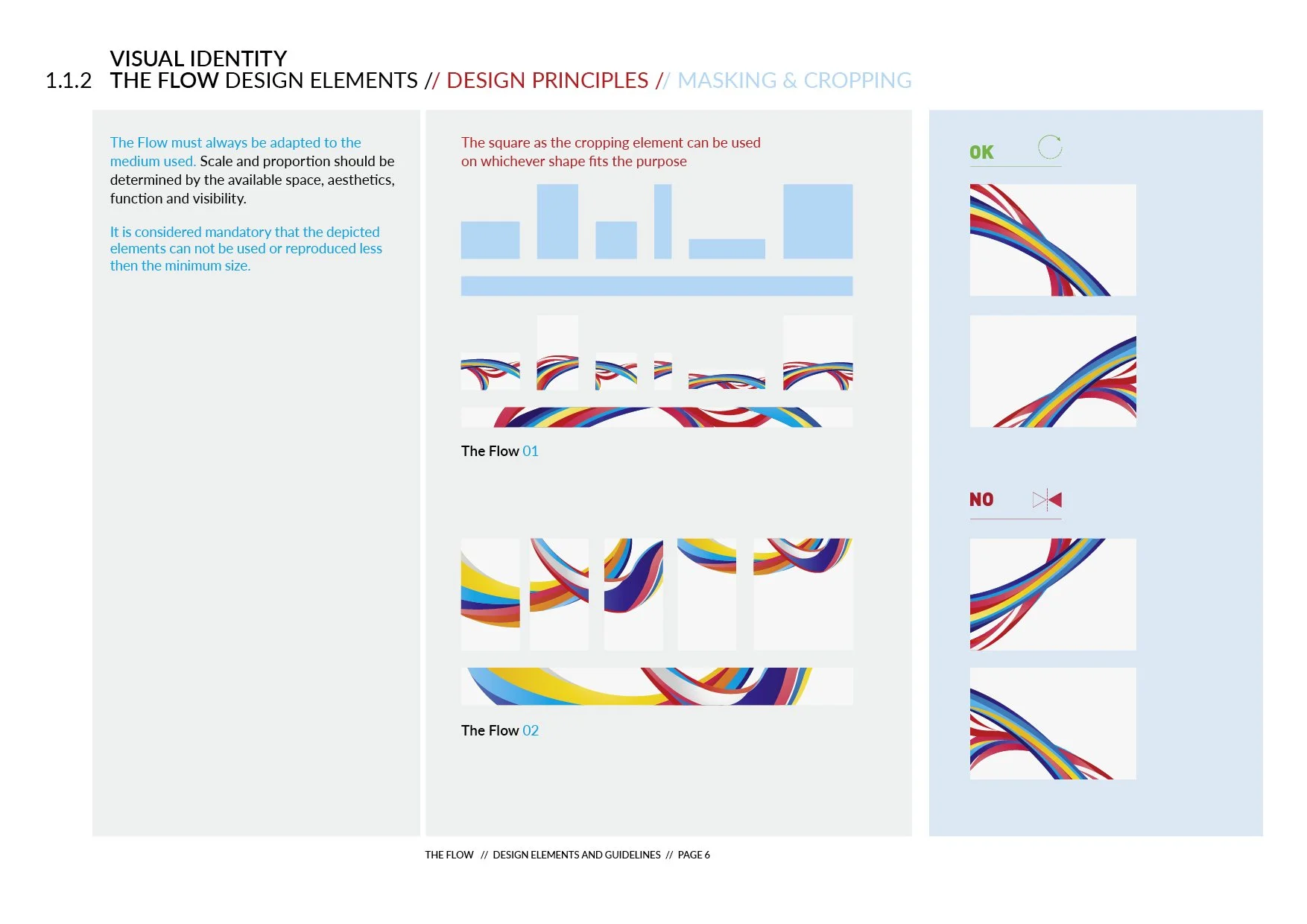
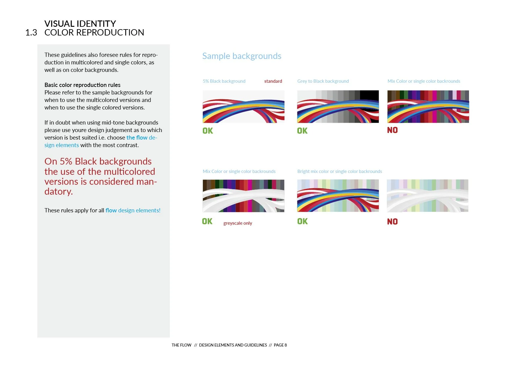
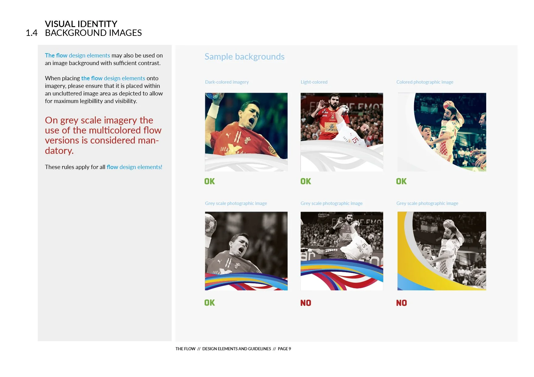
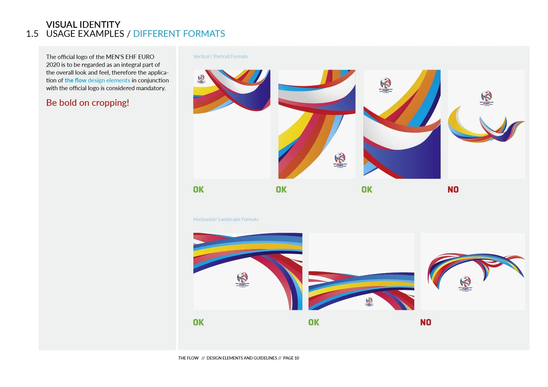
The FLOW
Alongside the logo, we created the FLOW, an organic ribbon in the national colors of the MEN’S EHF EURO 2020. Inspired by the idea of unity across the three host countries, it reflects movement, connection, and shared energy.
The FLOW ties all event levels and touchpoints together, visually extending the logo’s core message and creating a cohesive, flexible identity across the championship.
Creative Direction
MEN’S EHF EURO 2020 Logo
MEN’S EHF EURO Flow
MEN’S EHF EURO Logo Usage Guidelines
Development