
EHF EURO Logo System
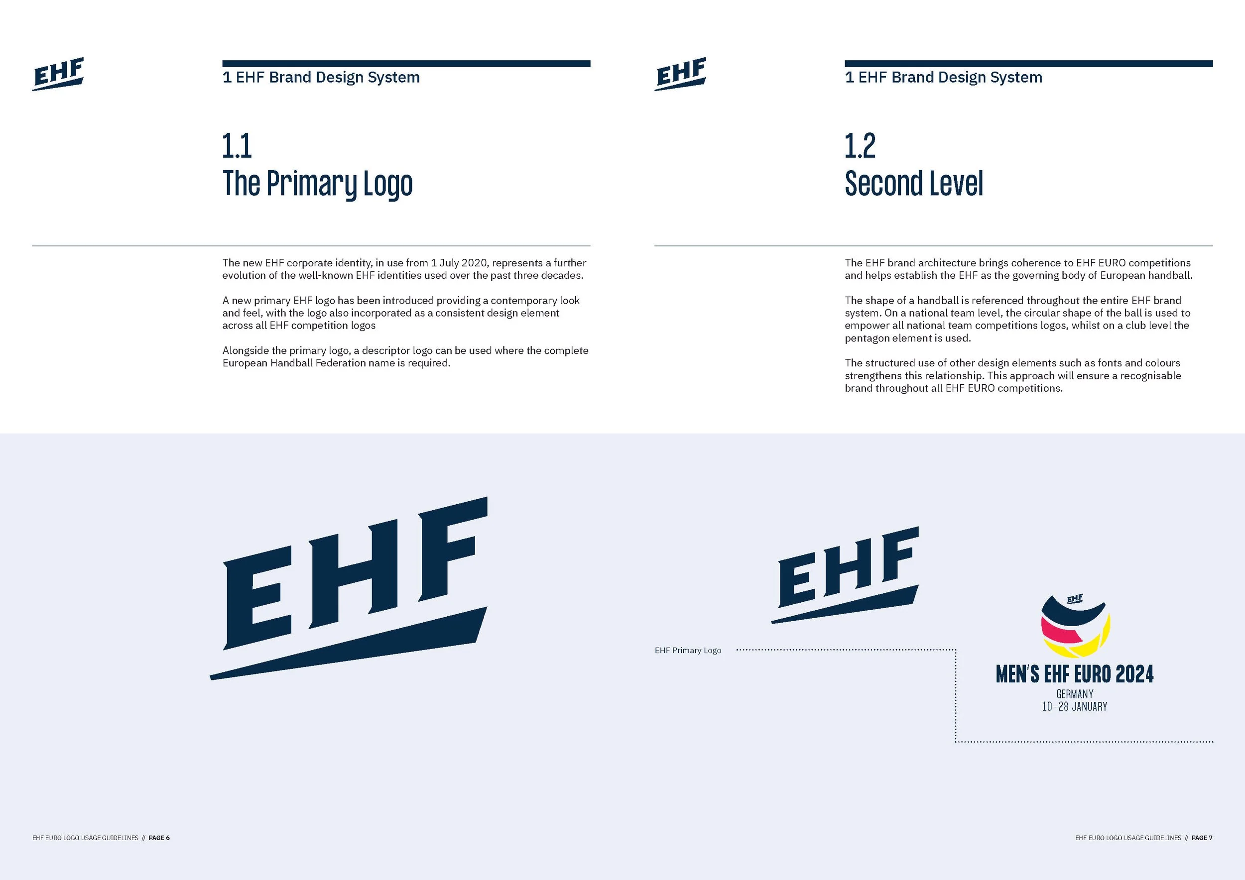
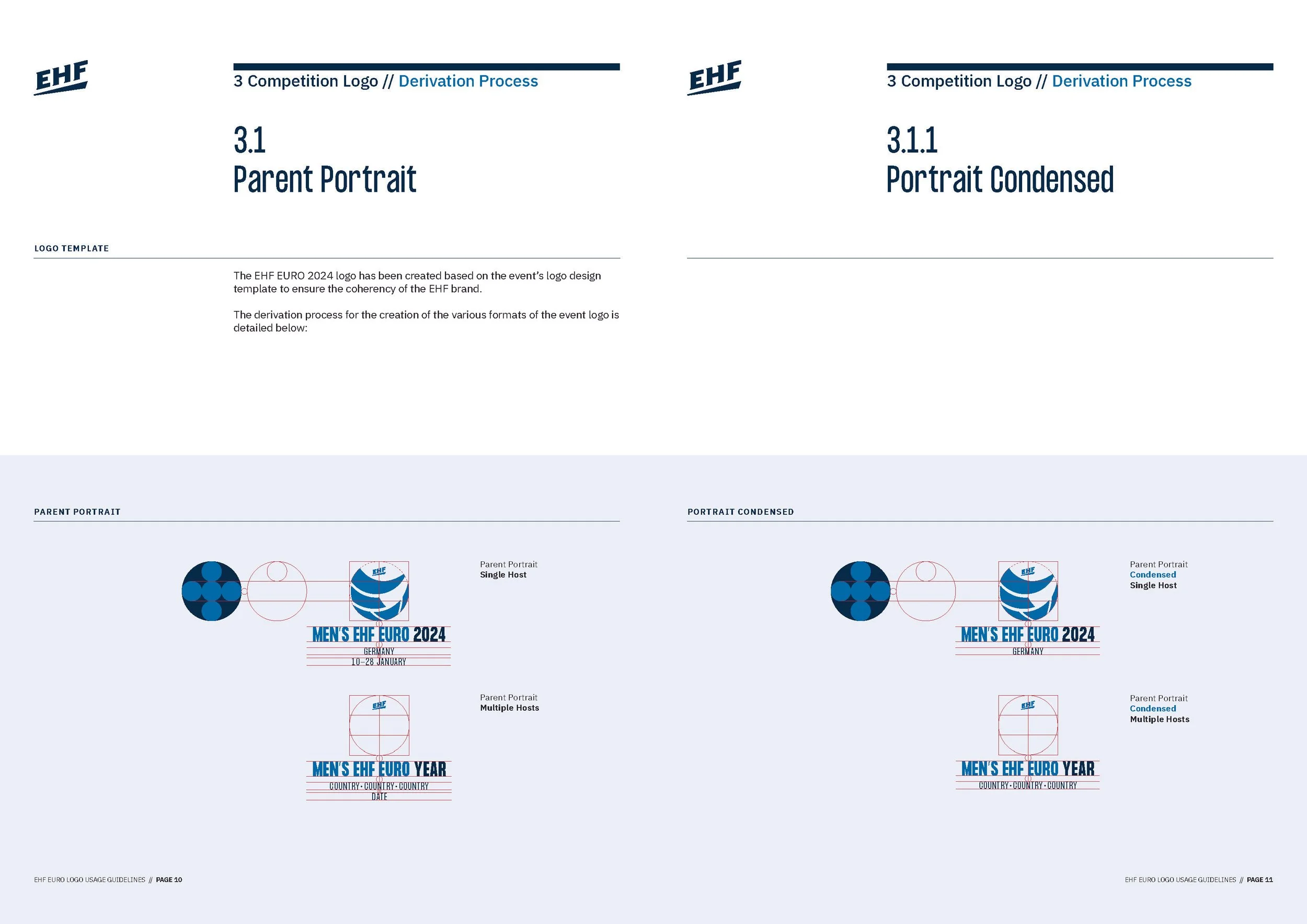
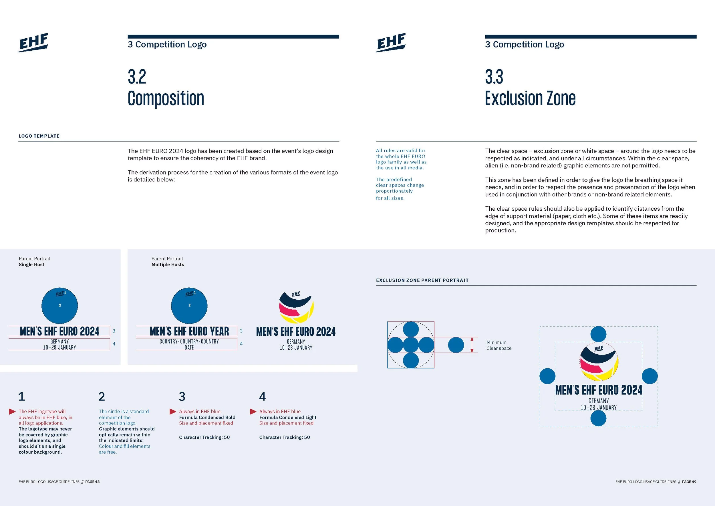
In 2018, we partnered with the European Handball Federation (EHF) to develop a cohesive logo system for EHF EURO competitions, in preparation for the upcoming 2020 EHF European Men's Handball Championship. Drawing inspiration from the handball’s circular form, the design ensures consistency across national team events while allowing host nations to incorporate unique elements. The system is built to accommodate multiple host countries within a unified visual identity.
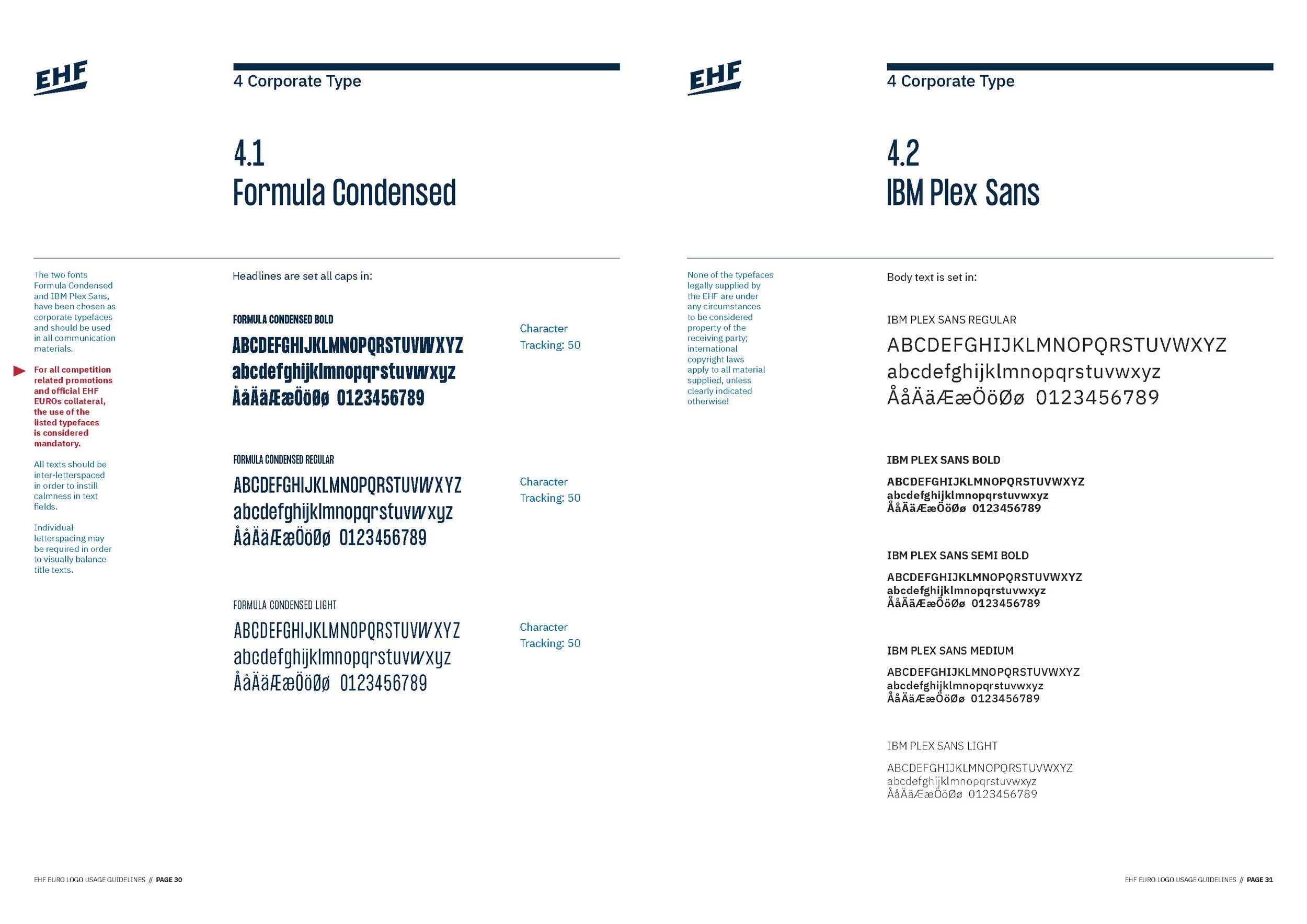
The EHF wordmark underwent a subtle overhaul, adopting a more dynamic and modern look, and a new typeface was introduced to further strengthen visual coherence across all touchpoints. This approach enhances brand recognition, simplifies the brand architecture, and reinforces the EHF’s identity across all European championships.


Creative Direction
EHF EURO Logo System
EHF EURO Logo Usage Guidelines
Development