
TAMARA ZEBA
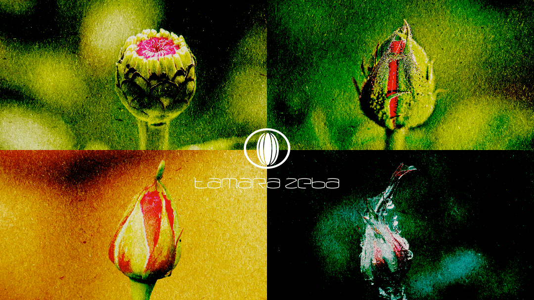
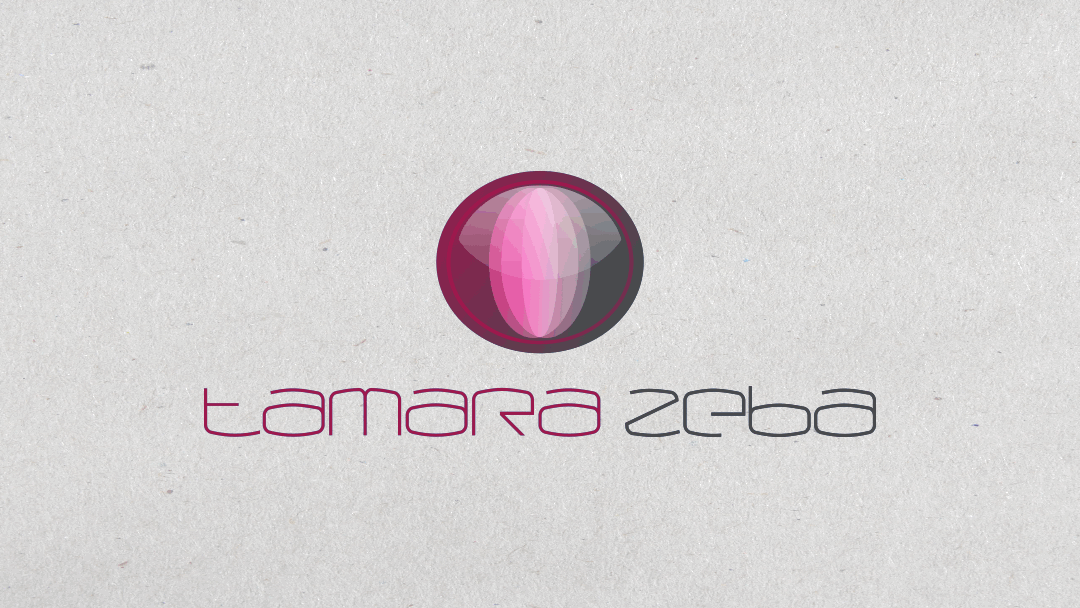
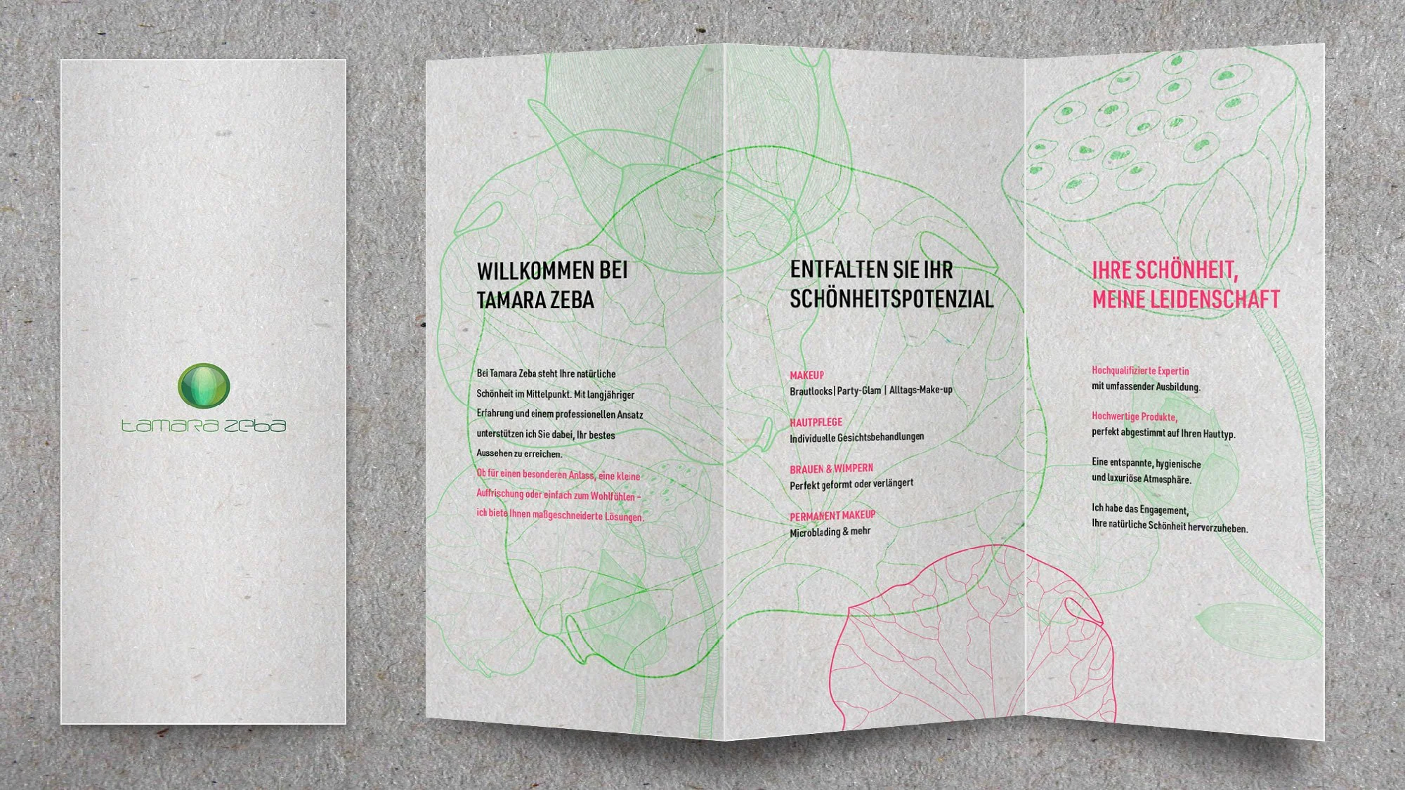
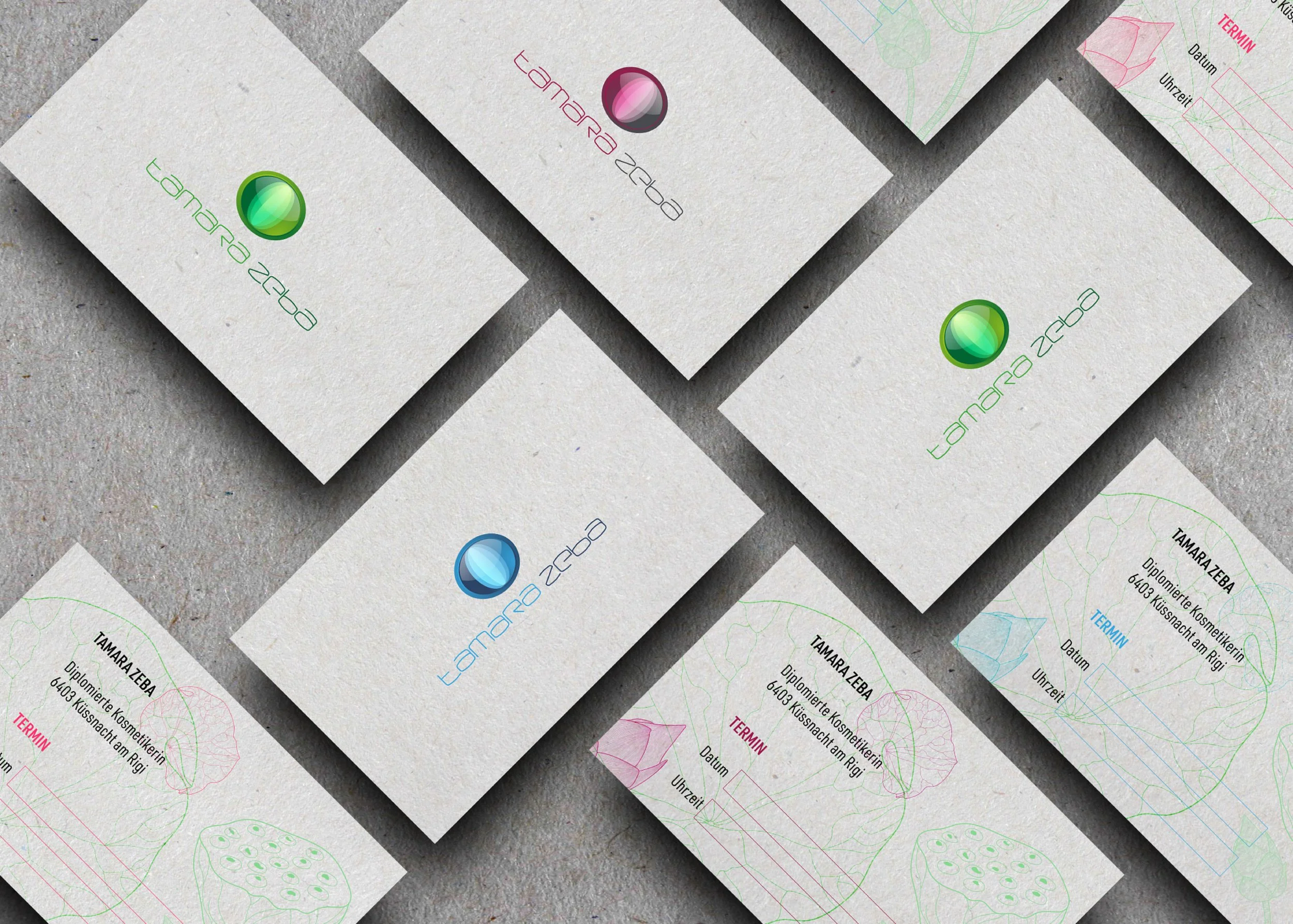
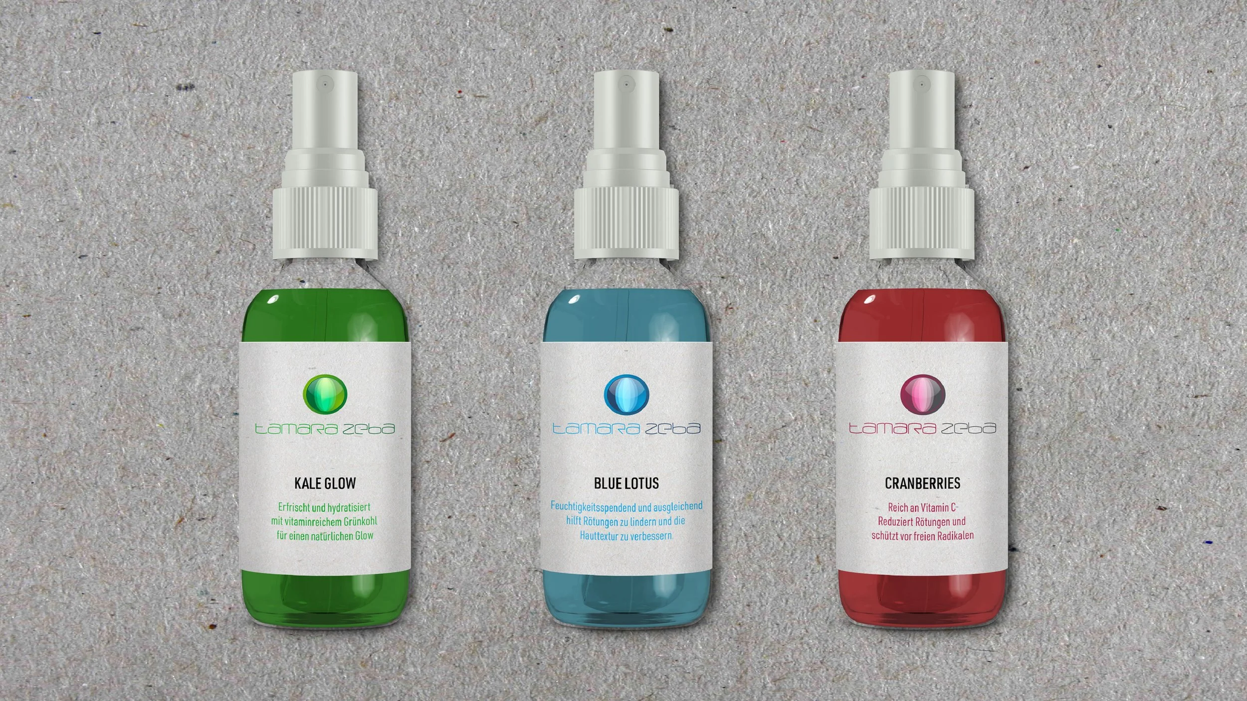
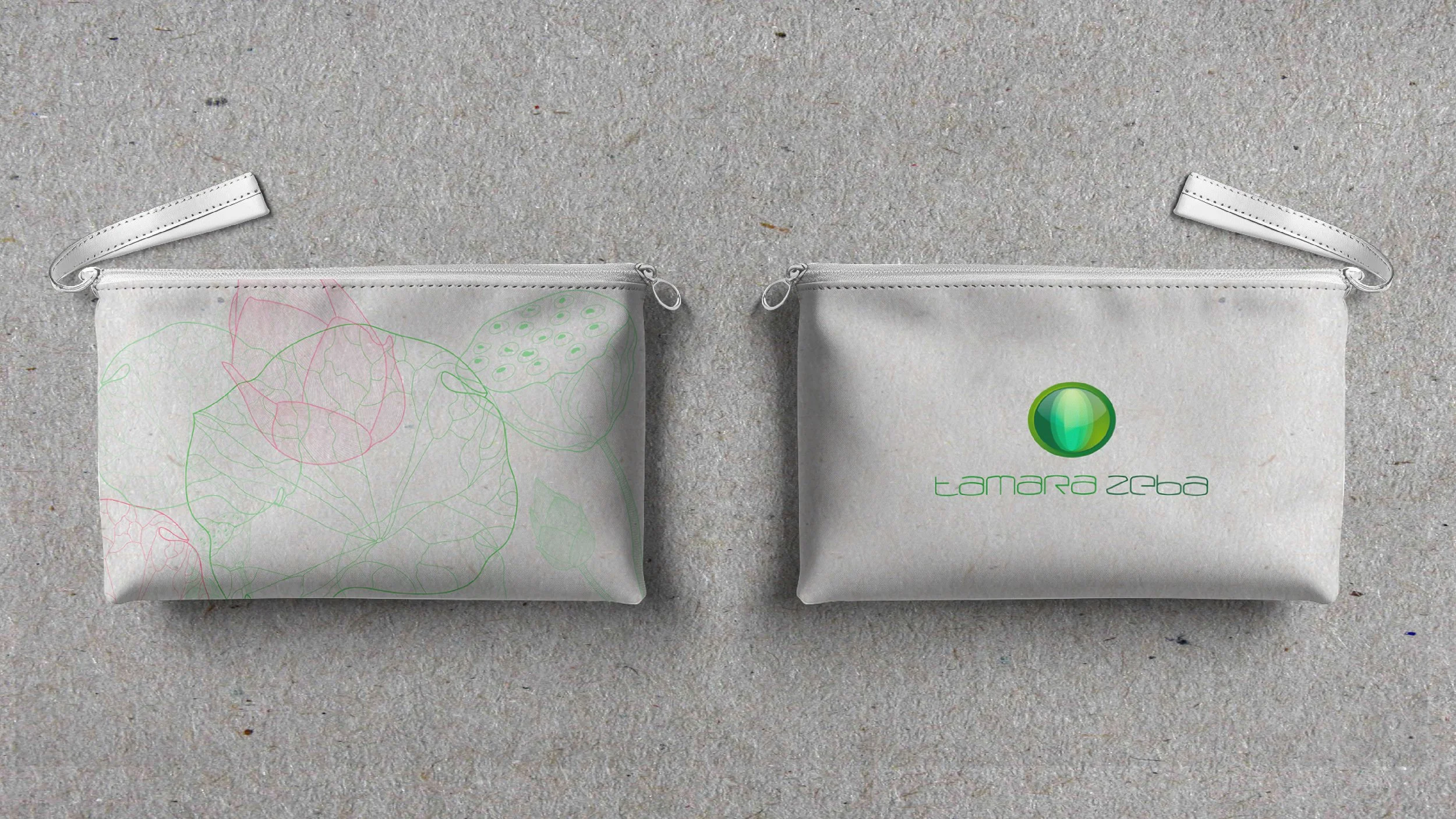
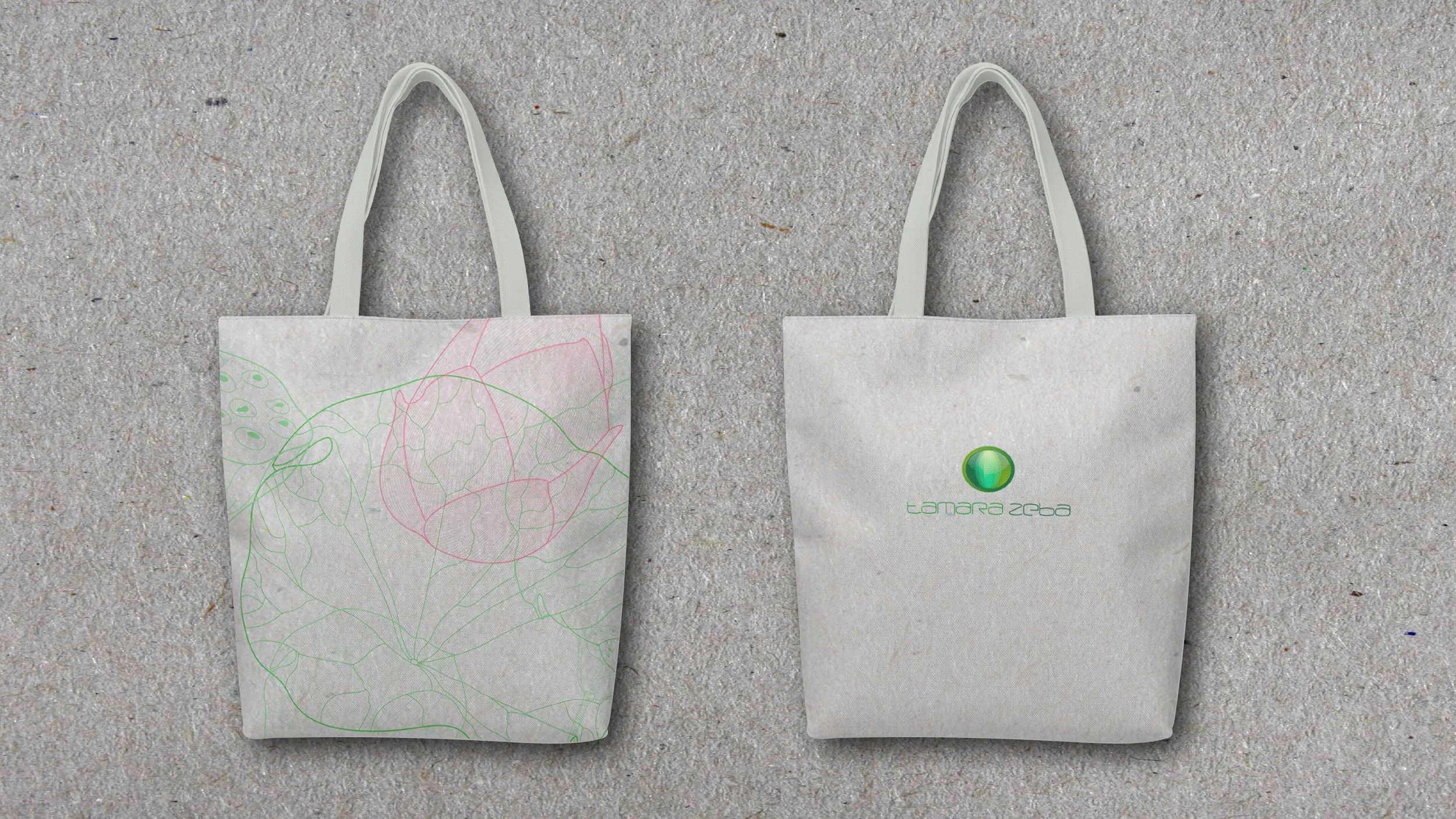
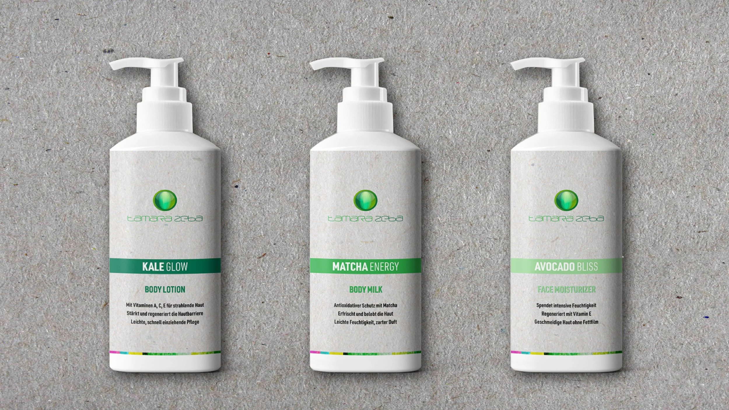
We chose a closed green flower bud as the emblem to capture the essence of transformation, growth, and natural beauty that lies at the heart of her business. The bud represents potential and renewal, aligning with her mission to reveal each client’s natural beauty. The custom-made font complements this theme with a refined, organic flow, adding a unique, personal touch to her brand identity. Together, the emblem and font create a cohesive visual language that speaks to elegance, precision, and sustainable care in every aspect of her work.
Creative Direction
Brand Design
Logo Design
Collaterals
Development