
PUBLIC MEDIA
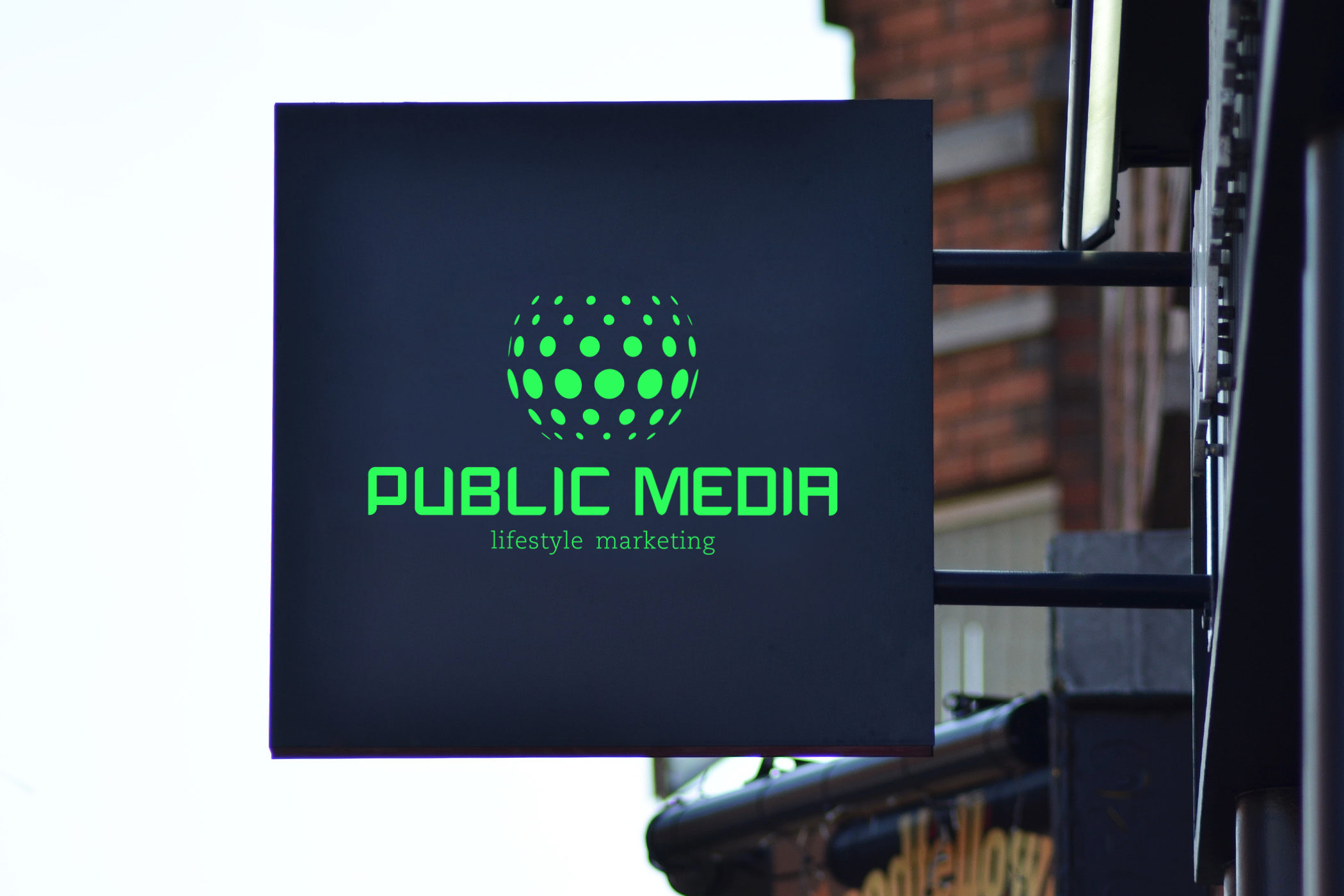
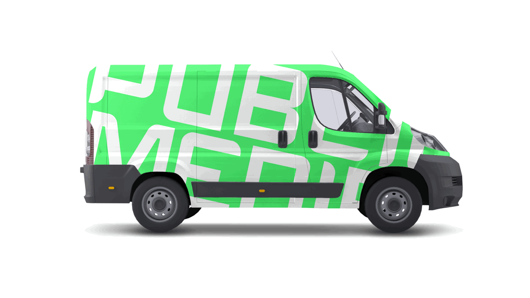
The Public Media logo was crafted to embody the brand’s essence of visibility and connection. The spherical design, composed of ellipses and circles, symbolizes connectivity, diversity, and radiance, core values that define the company’s vision. This bright, modern aesthetic mirrors the vibrancy of the brand’s lightboxes, capturing attention in public spaces. The custom text mark enhances the logo with a unique, personal touch, reinforcing Public Media’s distinct identity.
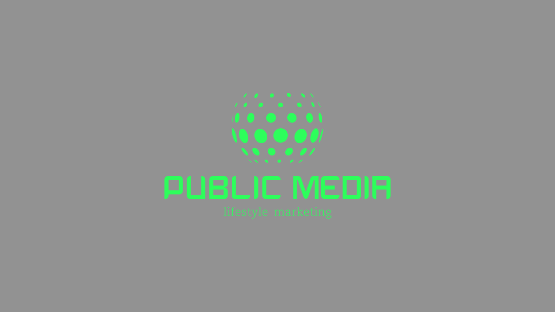
Why Bright Green?
The glowing bright green in Public Media’s logo symbolizes growth, visibility, and a fresh, modern approach. It mirrors the vibrancy of their lightbox ads, ensuring the brand stands out and feels dynamic and forward-thinking.
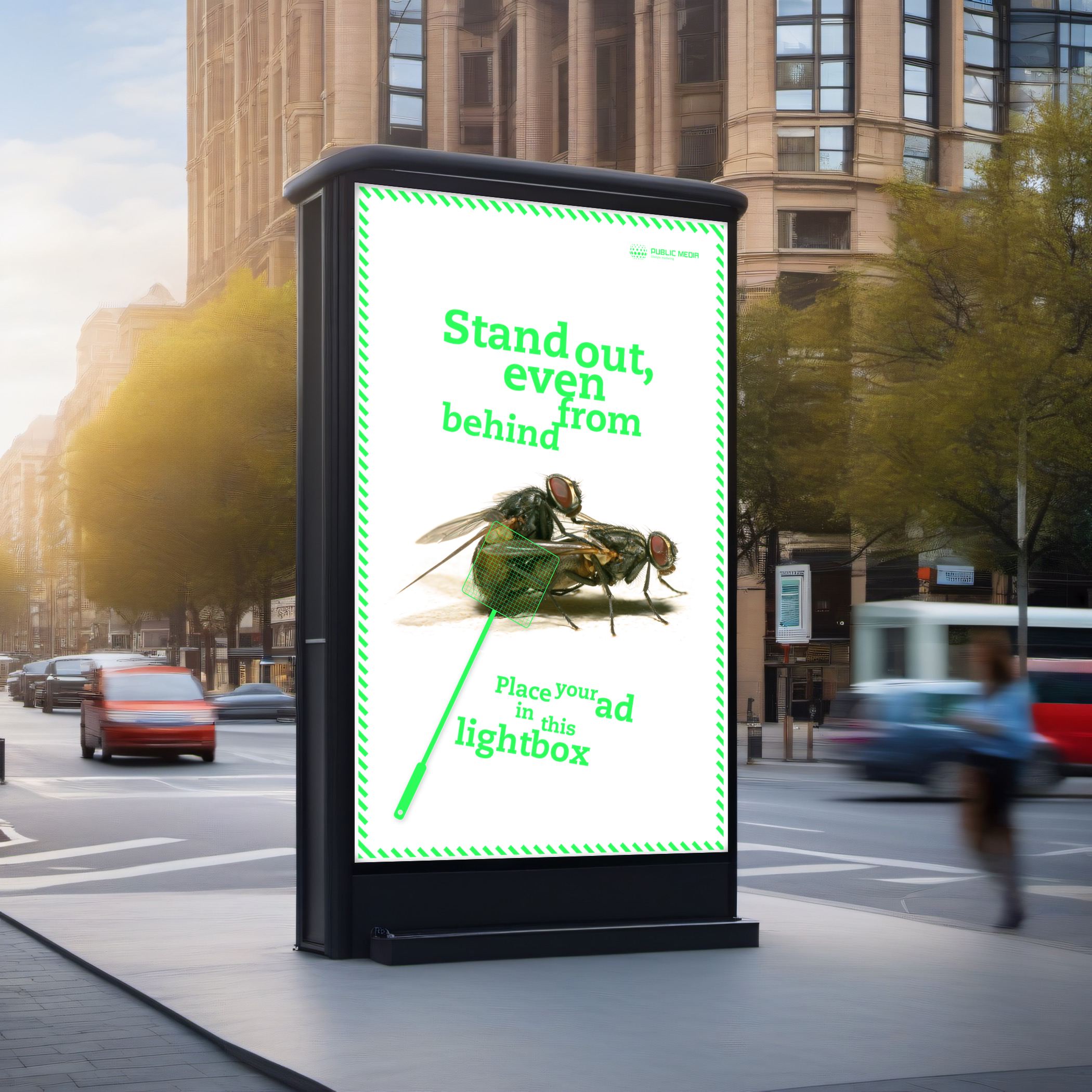
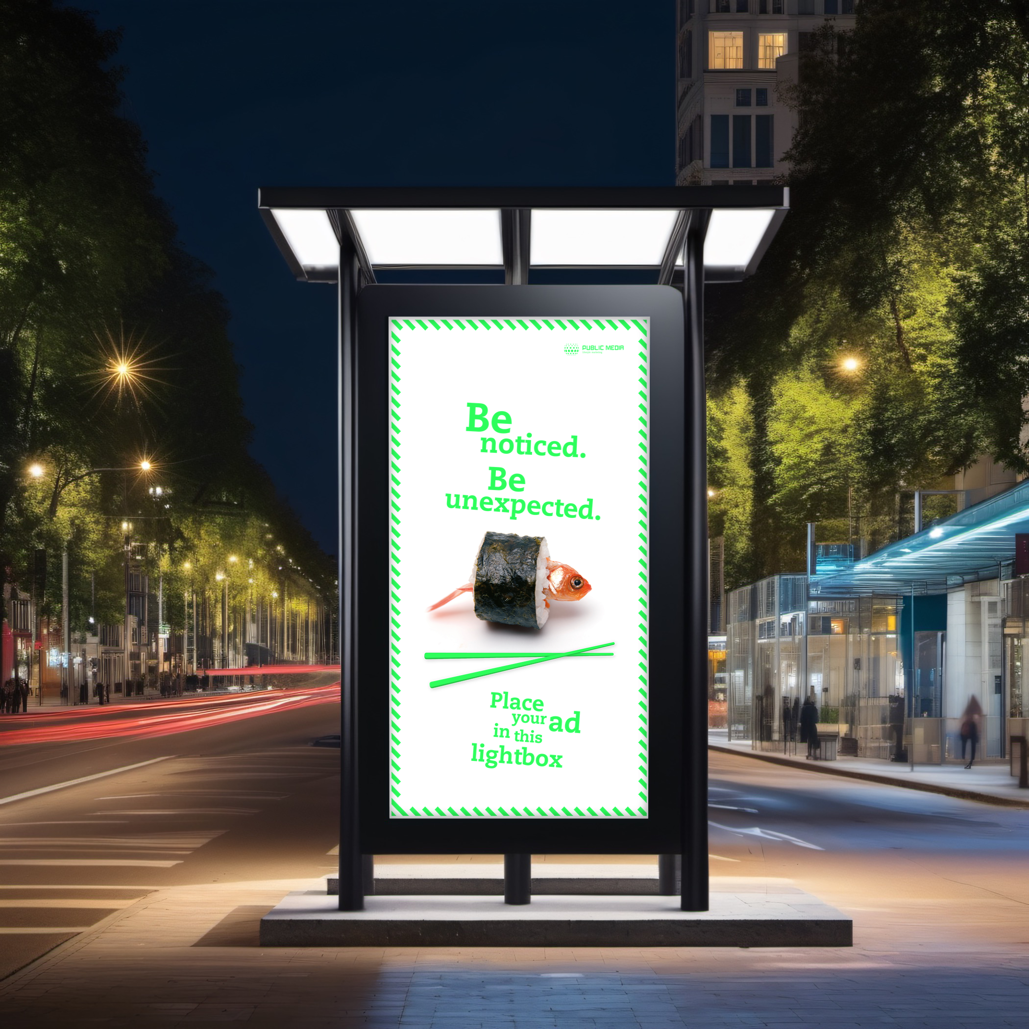
The client wanted quirky and unconventional ideas for his ad campaign to promote the light boxes, so we pitched concepts featuring little dogs dressed as Elvis, sushi, goldfish, and even flies. He loved the ideas, as long as we could tie them meaningfully into the campaign's message.

Creative Direction
Brand Design
Logo Design
Ad. Campaign
Collaterals
Development