
FOUR HILLS TOURNAMENT // Vierschanzentournee
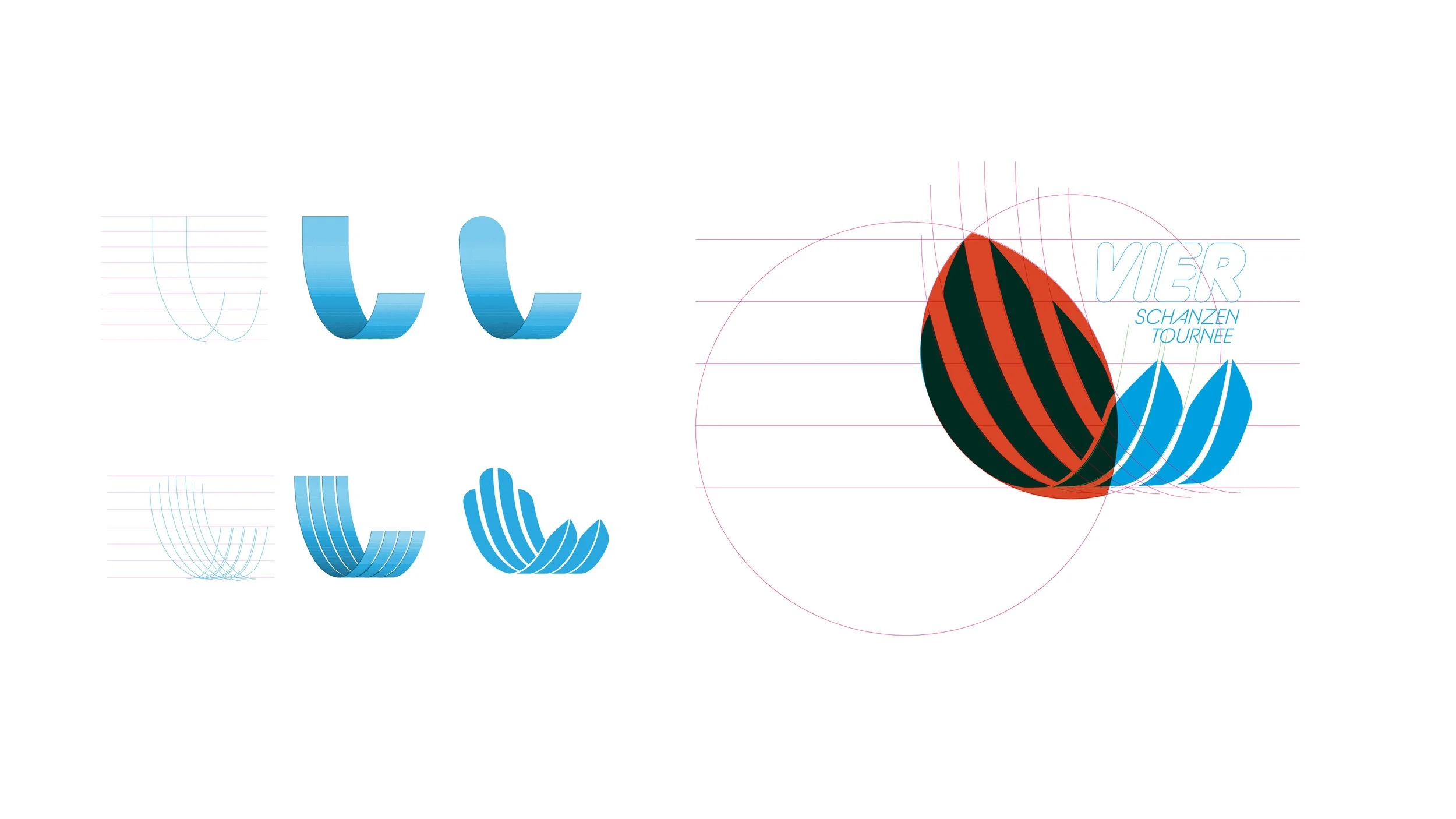
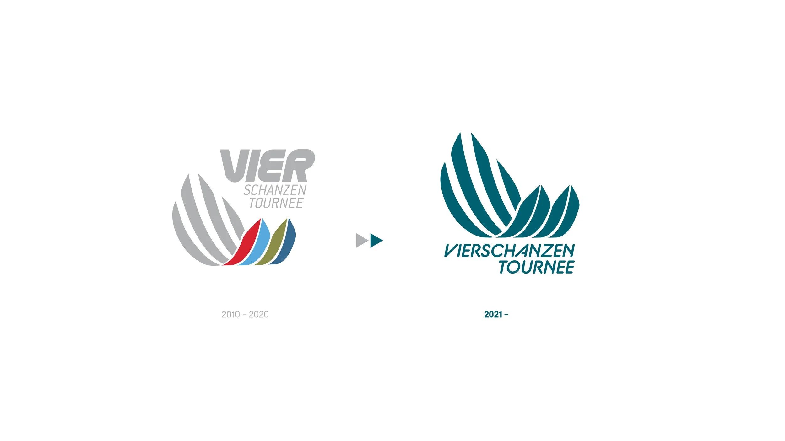
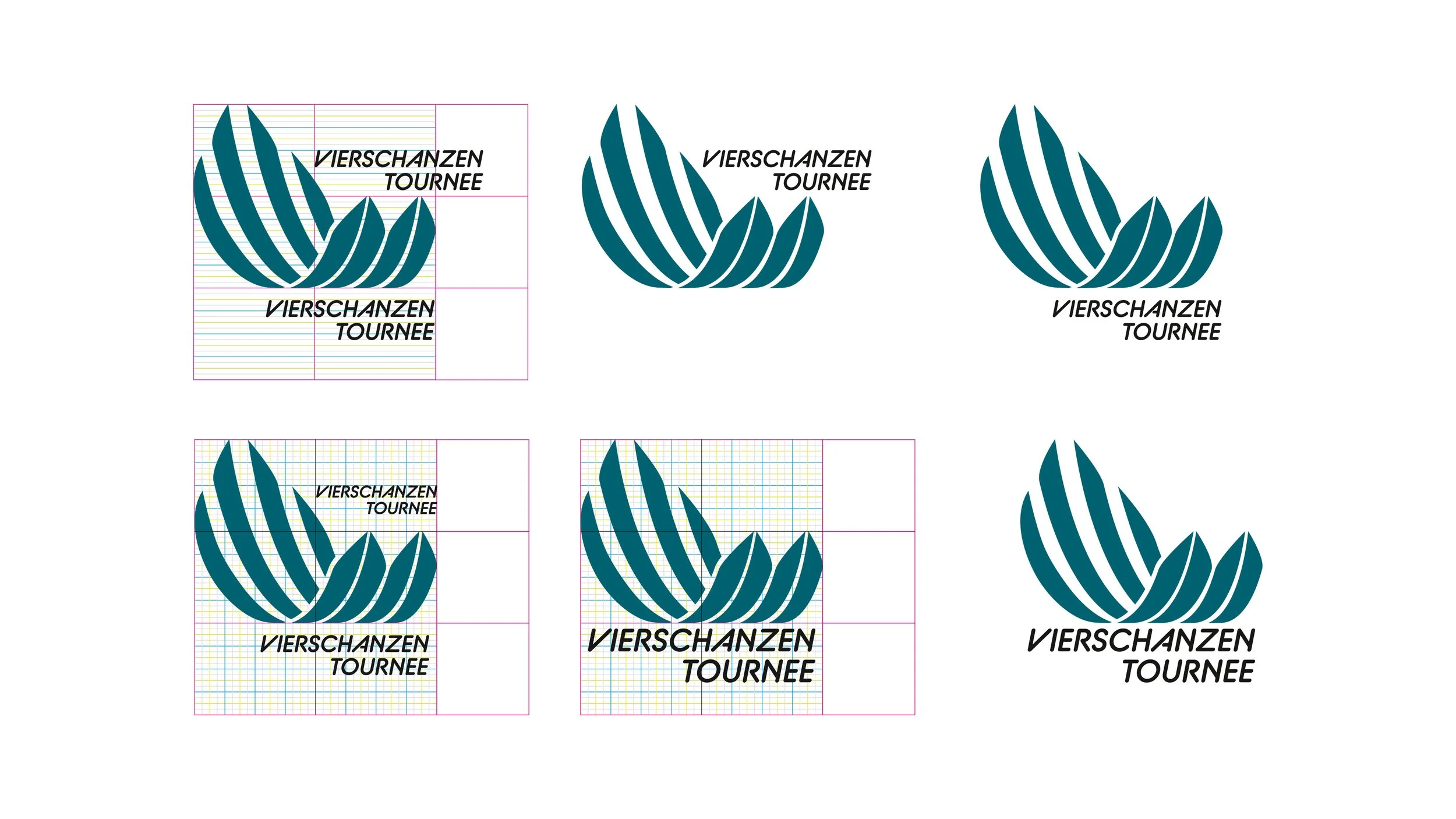
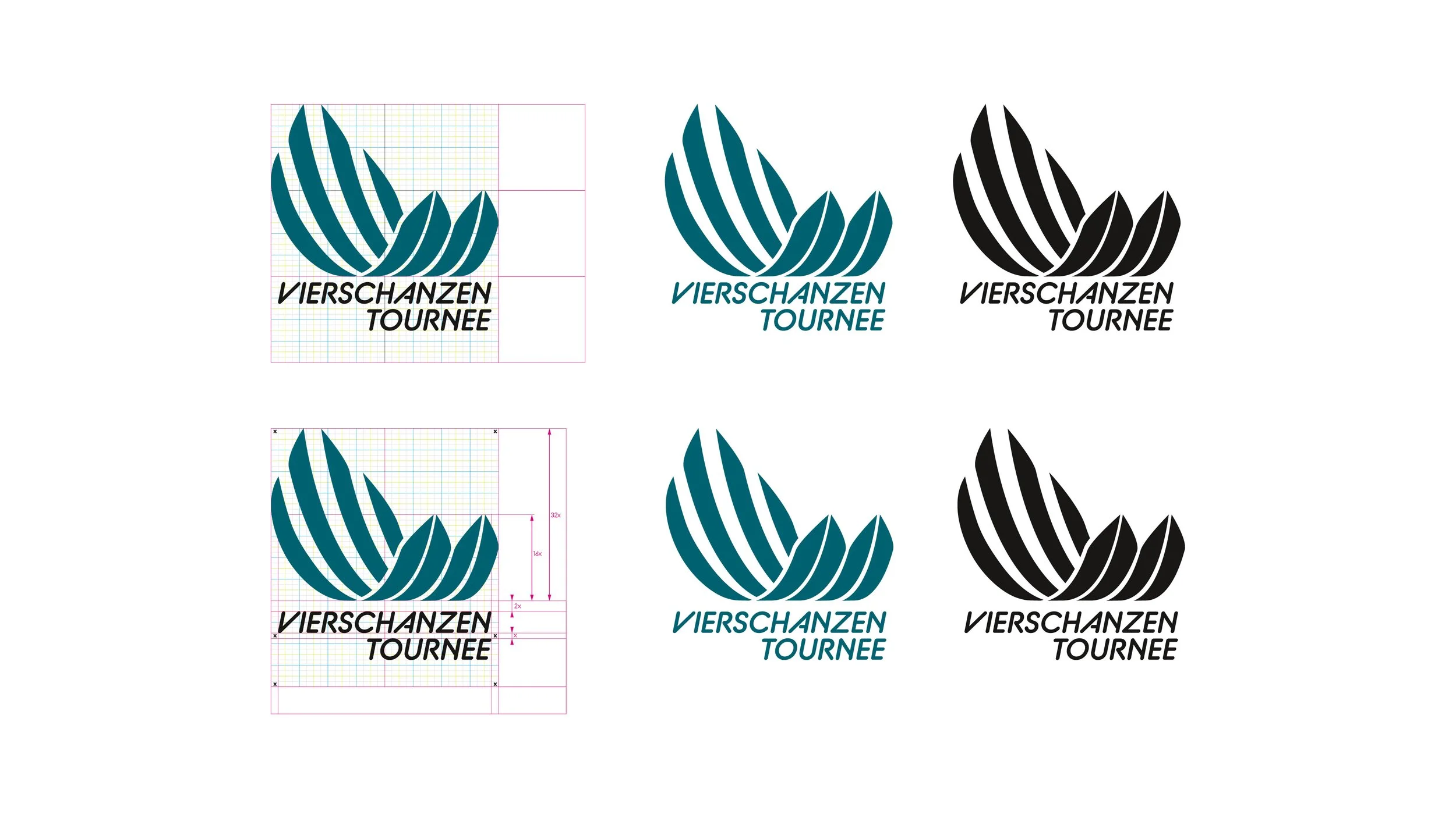
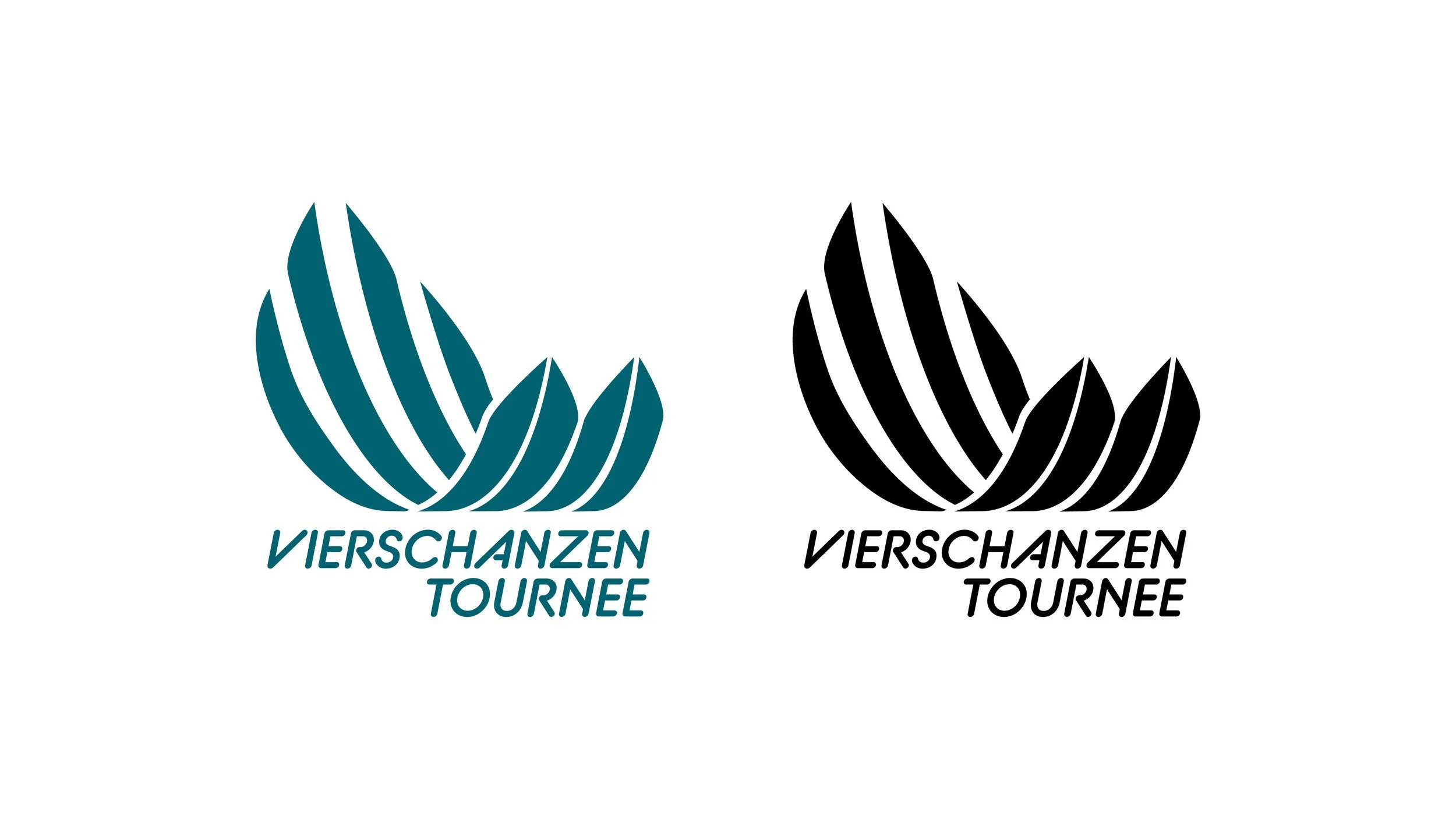
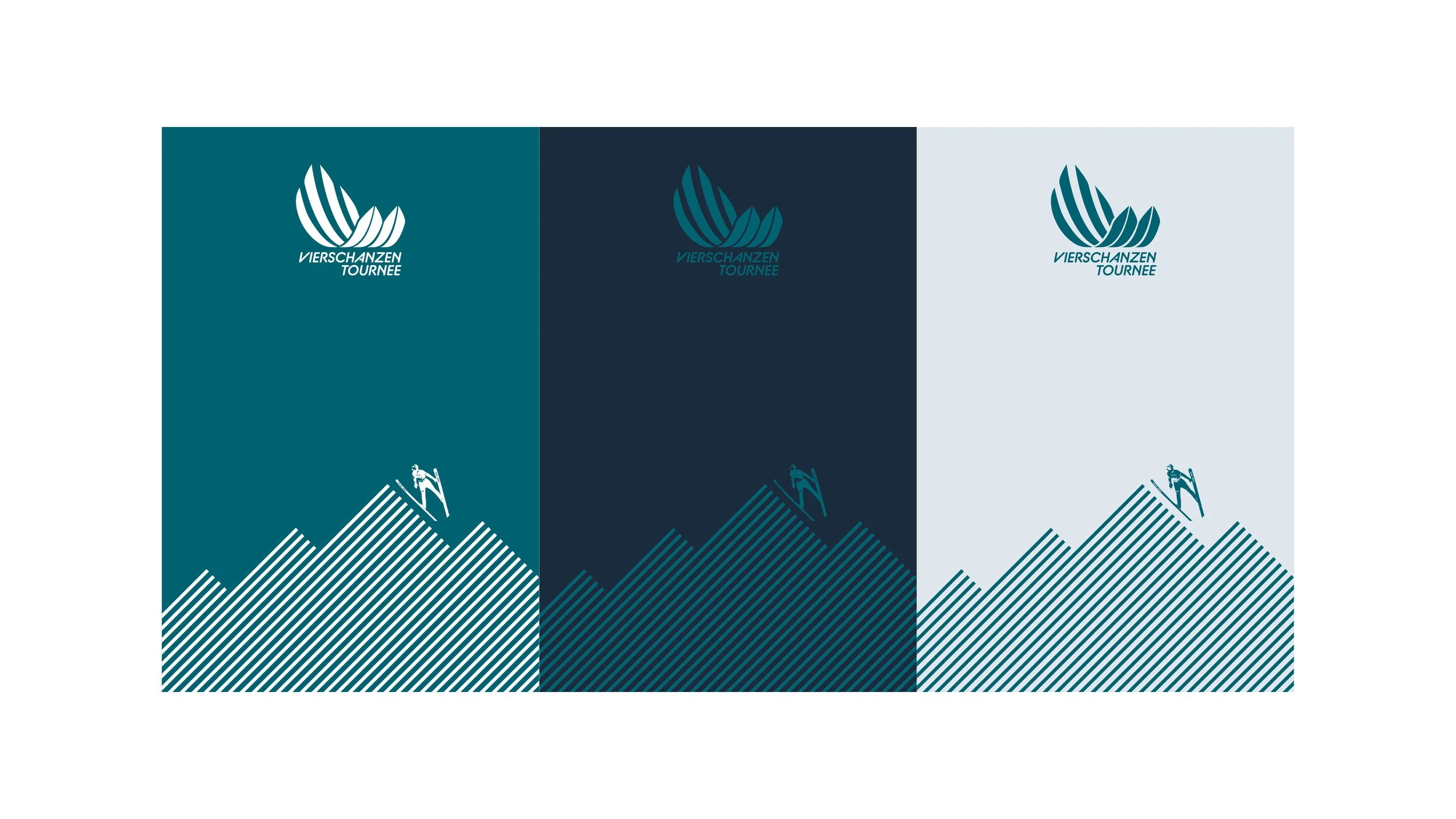
Rejuvenating our original creation was a strategic move to modernize the brand and enhance its appeal. We updated the logo by incorporating the BC Alphapipe TSB Bold font and repositioning the event name beneath the emblem. This modern, dynamic font improves readability and adds a contemporary touch.
Placing the event name below the emblem makes the iconography more prominent and memorable. These changes modernize the brand, improve visual impact, and create a cohesive identity that reflects the event's prestigious nature.
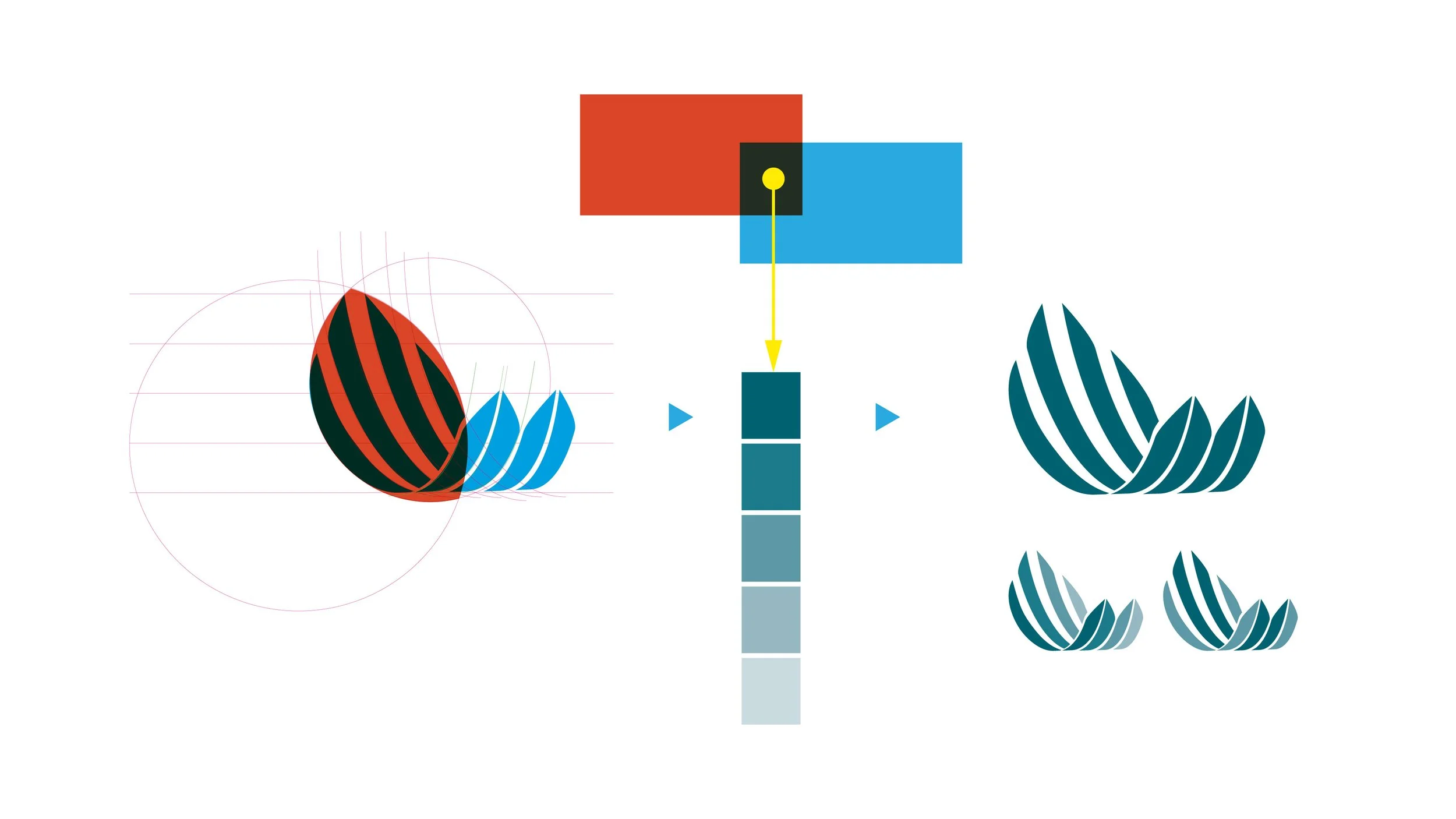
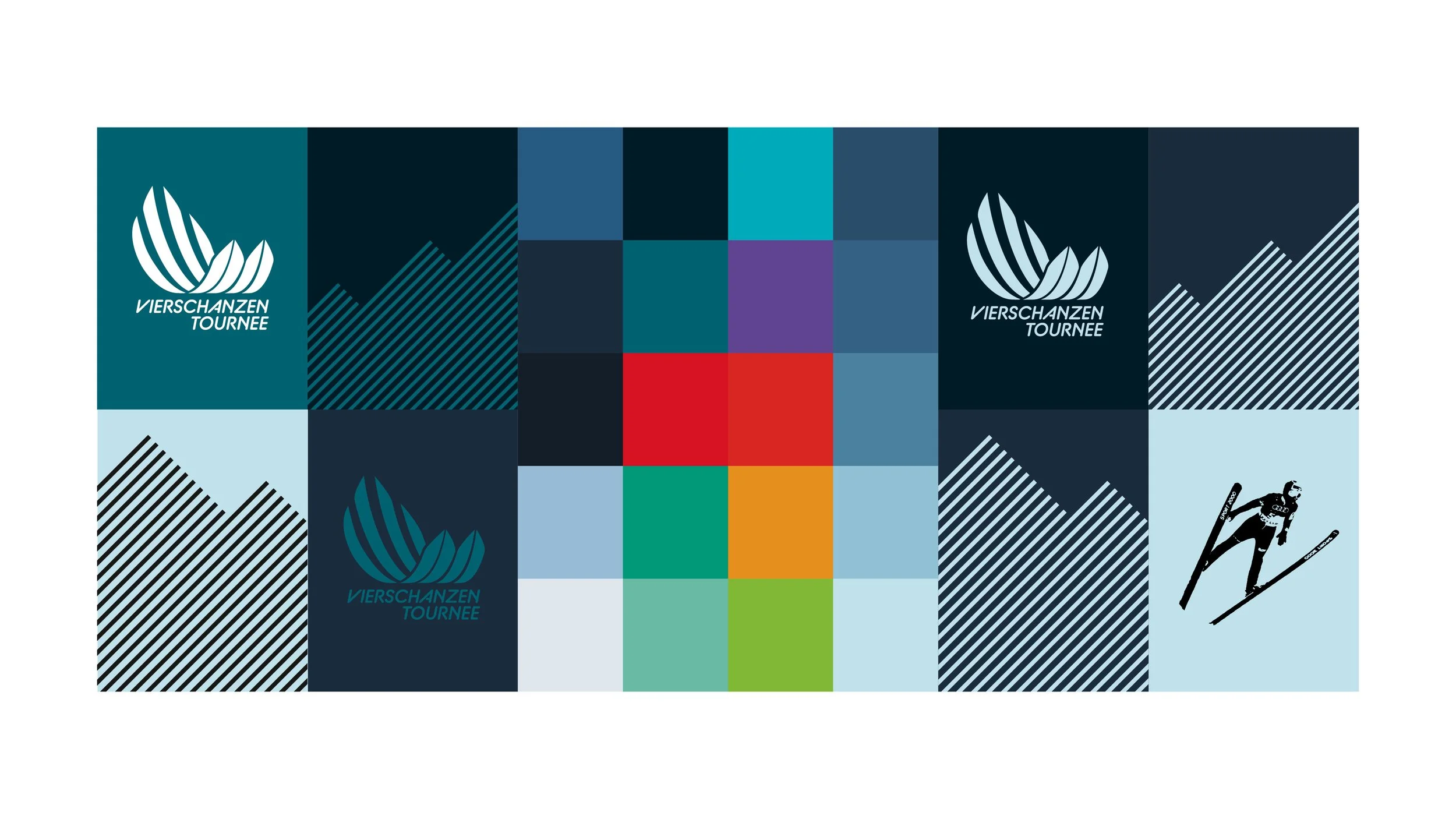
We changed the logo from five colors to a single color to create a more unified and harmonious brand identity. This simplification enhances brand recognition, makes the logo more versatile across various applications, and strengthens the overall visual impact, ensuring a consistent and memorable image.

Creative Direction
Brand Design
Event Design
Development